Challenge:Office Art (Classic Editing) Camera:Kodak CX4200 Location: My office, front lobby Date: Jun 5, 2003 Aperture: 4.5 ISO: 200 Shutter: 1/25s Galleries:Interior Date Uploaded: Jun 8, 2003
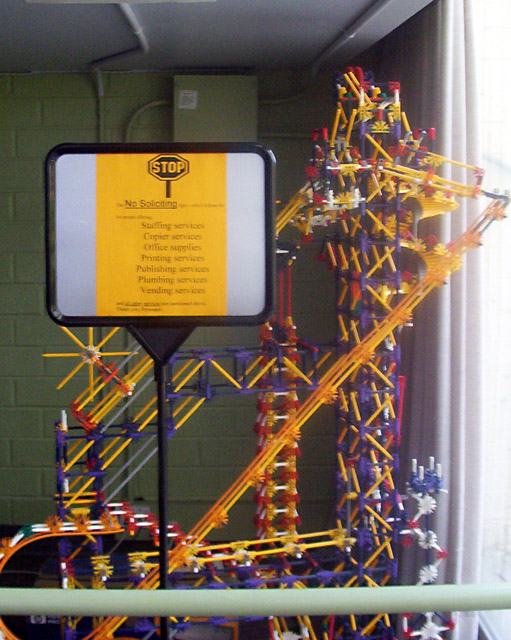
My office has a lot of cool things like this, actually. This is just inside the front doors. It used to be set up in a corner and actually move balls through it but the motor on it broke and no one ever replaced it, which is too bad since getting a photo of it moving would've been neat. I wish I could have gotten a little closer to make the print sharper, but I was about as close as I could get. Darn those cameras without zoom!
Some crop, autolevels, unsharp mask to try to make the text more legible.
Statistics
Place: 83 out of 86 Avg (all users): 3.8182 Avg (commenters): 3.6667 Avg (participants): 3.5636 Avg (non-participants): 4.0727 Views since voting: 1149 Votes: 110 Comments: 13 Favorites: 0
I like this. You had a real challenge going for you with the focus, which others have noted. A chair, table, or rail to steady your elbows on might have helped, if movement during the shot was the problem (happens to me a lot with my camera, I fear).
You might also try the shot again, with the curtain on the window as your right edge - and not the last inch of it, either. It will cut off part of your subject but I suspect it would address the glare.
The oh-so-serious sign is hysterical next to the whimsy of the toy behind it!
I love the inherent humor found in the sign and toys behind. Good eye! The image is a bit out of focus, though, when I think you'd really want that sign and colorful toys sharp and clear.
I'm not quite understanding this picture. I realize that it's a erecto-set sclpture but I'm unsure of what it is of. The lighting from the window ended up being a little too bright, so it's overexposed and uneven. The picture is also pretty much out of focus. I like the colors in the sculpture but that's about the only positive thing about this.
Blurry. Should have cut the window off of the right side and reduced the movement in the shot. I didn't understand the title til I read the sign, which is hard to read.
Well, the colors of the "contraption" are interesting and provide for some interesting contrasts... but the overall image needs a little help, I'm afraid. The overall image is blurry with no particular area being in full focus. The bar at the bottom and the window on the right seem to act as distractions. And I'm honestly not sure how the sign fits in with the rest of the shot.
The sign is pretty clear, but the glare from the window overpowers much of the image (even the sign). The subject seems to be the toy in the background (see title), but the focus says the sign is the subject. 6 Rob the Swash
Nice cubject, shame you couldnt do anything about the lighting its a bit bright for my liking coming from the right. A sharper focus would have been nice.






 Add photograph to your favorites
 Add photographer to your favorites

 Photographer found comment helpful.


