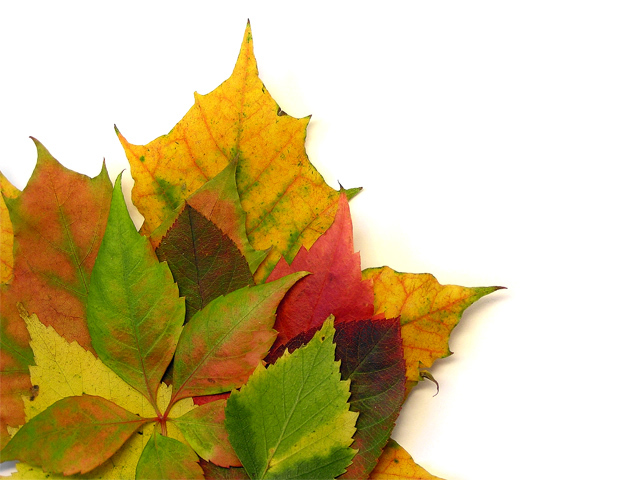
I like the way you arranged the leaves. The stark white background would make a nice area for text for an ad or greeting card - or even a tourist informational brochure. For me though, it doesn't convery the idea of celebration as well as other entries in the challenge. 6
lovely composition. the white background feels fairly stark, like the background's actually missing. perhaps a slightly richer hue just to act as a foil for the fall colors?
I like this. I wish they were in a natural setting. Or maybe a dark background would have suited them better. I love the points of the various leaves and their wide array of different shades.







 Add photograph to your favorites
 Add photographer to your favorites


 Photographer found comment helpful.


