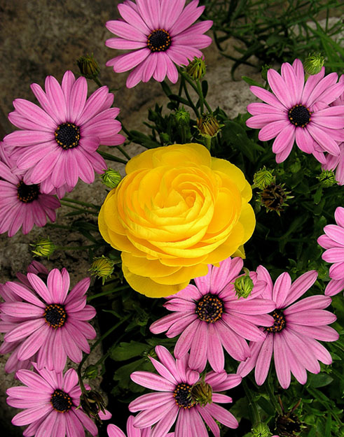
Pretty, contrasting flowers. Very nice color. Lighting - just a touch dark overall, but much lighter would have made the yellow a bit too harsh. Nice image.
9 Rob the Swash
Wonderful flowers, but the rose looks totally out of place. I suspect that\'s just what you wanted to achieve, but it still looks very strange to me. But, your focus and lighting is very good. I generally like the \"odd one out\" idea, maybe if you had placed the rose not in the center of the image ... dunno. (5)
This is picky, but I'd like to see the yellow flower more off center. I think that if you were to crop off the top right below the top most flower, this would bring the yellow flower up toward the top a bit, and would also remove the green tangle in the upper right corner that I find to be a bit distracting. Colors are good, as is focus and clarity.
Lovely colours. It looks more like a flower arrangement than a garden though. Perhaps a different perspective would have matched the magazine title better? 7







 Add photograph to your favorites
 Add photographer to your favorites


 Photographer found comment helpful.


