| Author | Thread |
|
|
10/12/2005 04:12:22 PM |
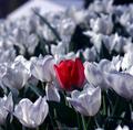
I agree with others that a different background might have been a better choice for the image. You wrote in your comments that you tried to eliminate reflections. A few strategic light reflections might not have been a bad idea though. They would give depth to the picture. Here's a couple shots I took earlier this year where light is reflected off the glass. They seem to have been well received:
//www.nwoutdoorgrrl.com/index.php/simple/comments/seattle_photographic_take_2/
//www.nwoutdoorgrrl.com/index.php/simple/comments/fun_with_dry_ice/
//www.nwoutdoorgrrl.com/index.php/simple/comments/ghostly/
Take this with a grain of salt. Just a few thoughts to mull over. |
|
 Photographer found comment helpful. Photographer found comment helpful. |
Comments Made During the Challenge  |
|
|
10/10/2005 10:52:07 PM |
|
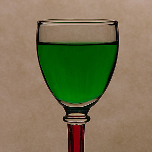
Nicely taken shot, though I found the background detracted from the picture. Perhaps a white background may have made the red and green stand out a bit more. |
|
| Photographer found comment helpful. |
|
|
10/09/2005 03:37:00 AM |
|
I like the clarity and I like the colors. |
|
| Photographer found comment helpful. |
|
|
10/08/2005 09:48:05 PM |
|
The lighting is a bit dark -- I'd like to see brighter colors. The background doesn't go well with the composition. It makes the colors look muddy. A white background might solve both the problems. |
|
| Photographer found comment helpful. |
|
|
10/06/2005 06:17:26 PM |
|
That is very nice. Simple and demostrates the challenge well. I'm not the best on choosing backgrounds, but I wonder if another color could enhance the photo. Possibly a black back with lighting on the colors to illuminate the. What would bottom light look like through the glass? |
|
| Photographer found comment helpful. |
|
|
10/06/2005 03:35:46 PM |
|
I really like this idea. How did you do it? I only wish it was lit brighter. |
|
| Photographer found comment helpful. |
|
|
10/06/2005 07:53:11 AM |
|
I wonder if a pure white background would have made this pop a bit more? |
|
| Photographer found comment helpful. |
|
|
10/05/2005 05:05:12 PM |
|
I think this would have been more striking with a black background. |
|
| Photographer found comment helpful. |
|
|
10/05/2005 03:21:03 PM |
|
I'd like to see more red and a tighter crop. There needs to be a little more light here too. |
|
| Photographer found comment helpful. |
|
|
10/05/2005 09:30:18 AM |
|
Nice, meets the challenge, colours look a little dull, maybe better lighting would help. |
|
| Photographer found comment helpful. |
|
|
10/05/2005 01:58:13 AM |
|
with a white background it would have looked stunning! |
|
| Photographer found comment helpful. |
Home -
Challenges -
Community -
League -
Photos -
Cameras -
Lenses -
Learn -
Help -
Terms of Use -
Privacy -
Top ^
DPChallenge, and website content and design, Copyright © 2001-2026 Challenging Technologies, LLC.
All digital photo copyrights belong to the photographers and may not be used without permission.
Current Server Time: 06/28/2026 03:31:49 AM EDT.