| Author | Thread |
|
|
10/06/2005 10:58:40 PM |
| I agree the text is too 80's and bland for a business card but the picture rocks. congrats on the new cam BTW. |
|
 Photographer found comment helpful. Photographer found comment helpful. |
|
|
09/30/2005 11:33:29 PM |
I like it, my first thoughts without reading anyone elses were about how clean and simple it was. On the other hand: having read the comments, I do wonder how reasonable in price these will be to reprint with sufficient quality, and also whether it's the right kind of picture to get you jobs. Of course, that depends on on what you want to shoot!
Message edited by author 2005-09-30 23:33:37. |
|
| Photographer found comment helpful. |
|
|
09/30/2005 10:56:50 PM |
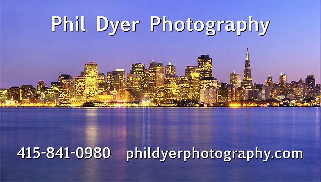
Nice cityscape, but don't like the text's appearance. Wanna make it a project, post the plain pic and we'll lay in some whose color, tracking and typeface "works"? :)
What sort of work are you trying to get? Landscape is what I would conclude from the paucity of info on the card--clean is nice, but you might want to add an e-mail at least. |
|
| Photographer found comment helpful. |
|
|
09/30/2005 10:50:17 PM |
not bad. there's something about it though.. not sure... it seems like the card would typecast you or something to doing only cityscapes. i would go with a more emotive shot that is not geographically specific. ? i might be way off, just a suggestion.
|
|
| Photographer found comment helpful. |
|
|
09/30/2005 10:45:57 PM |
| Very simple yet effective. I, personally, am not too fond of the type you chose, but the layout is clean. |
|
| Photographer found comment helpful. |
Home -
Challenges -
Community -
League -
Photos -
Cameras -
Lenses -
Learn -
Help -
Terms of Use -
Privacy -
Top ^
DPChallenge, and website content and design, Copyright © 2001-2026 Challenging Technologies, LLC.
All digital photo copyrights belong to the photographers and may not be used without permission.
Current Server Time: 05/11/2026 05:46:30 AM EDT.