I think that this is quite random and creative = ) I very much like the spacing. and the monocolor thing (sry im not good whith the correct termonology).
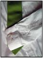
The composition could be improved if you cut down on the "empty space". There is too much white space that the strawberry is just swimming in it. You want to draw the eye directly to the main focus immediately so a closer zoom or crop showing the strawberry would have been better. Light sources from two sides top left diagonal and bottom right diagonal may have eliminated the deep shadow that detracts from the strawberry. Lastly, I would have chosen a better strawberry with a more vibrant green stem - the stem here is a flat dull green/brown that is a very unappealing compliment to the vibrant red of the strawberry.






![[green]](https://images.dpchallenge.com/images_challenge/0-999/387/1200/Copyrighted_Image_Reuse_Prohibited_238074.jpg)
 Add photograph to your favorites
 Add photographer to your favorites

 Photographer found comment helpful.


