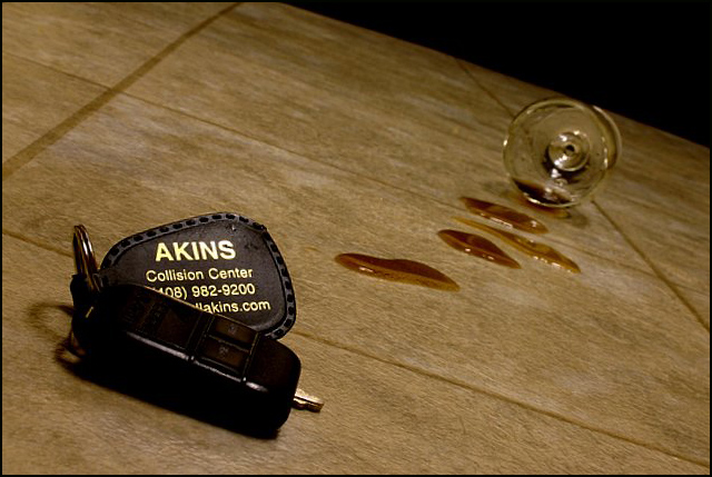
I can see the fall -- stumbled on the way to the car, all bleary eyed (color cast) and dropped the keys and watched as the glass skidded across the floor spilling the last of your latest drink. The message is strong...
...Unfortunately it requires the viewer to read a lot into the image that simply isn't there without the title. Don't get me wrong, the composition that is here works -- the tilt of the tile and strong diagonal controlling the eye and giving a sense of being off-balance. But I feel it fails to provide a complete visual connection with the message -- which is likely what resulted in the lower than average score.
How to make it better? Well... Perhaps including more of the driving theme, such as placing the scene out on a driveway or street. Also, some portion or the person that took the spill could have been in the shot -- at least a hint of a presense, such as a shadow.
As it stands it is a good idea that was reasonably well executed -- but stands too much in isolation, relying on the title to prompt the viewer to fill in far too many gaps.
Santa Clara. Ah. California. Long night for you. Interesting arrangement. Not sure how a glass survived hitting the tile floor. and these pools in a row. Good luck.
OKay this is a fantastic picture! This is the first picture I've seen in this category that needs to place. I love that the keychain has information for a collision center. This could very easily be an ad in a magazine or maybe even a high school or college newspaper. Congratulations, really...I'm rooting for you to take the blue ribbon!
Creative play with the Collision Center noted on the key ring. The shifted angle supports your message, as well. Great advertisment for drinking / driving responsibly.






 Add photograph to your favorites
 Add photographer to your favorites

 Photographer found comment helpful.


