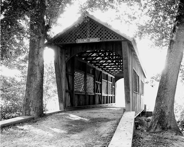
I love the stark contrast between the blown out background and the bridge itself. Really draws attention to it. It's also perfectly focused and exposed.
Nice shot. Like a lot the composition and the subject. I'm not sure if I would like it more without the blowed lights, but it's quite interesting this way.
This is the clear winner of the three. I am mixed about the strong backlighting though. On the one hand, it's different and interesting that way. On the other hand, it seems to dominate. I think some other processing techniques might help to emphasize the bridge, if they are allowed in the contest. For one thing, you could try an "old time" treatment, allowing the edges to vignette with "age".
Anyway, it's hard to see a solution without playing with it, and it's actually nice as is! So when you are satisfied with this one, it's ready for entry!
I'm still thinking about whether I like it or not...
The composition is good, I like the camera level at which it was taken. There are natural leading lines here with the bridge and road - takes me to ???. Ahh...the light. I SEE the light! ;^)
This works well in B/W - probably better than color. Sepia might be interesting also. Did I mention the image is a bit "hot", maybe a bit overexposed? He-he.
Ok, ok...I like it. The extreme exposure in this case works very well. Job well done.




 Add photograph to your favorites
 Add photographer to your favorites

 Photographer found comment helpful.


