| Author | Thread |
|
|
12/04/2005 06:17:44 PM |
|
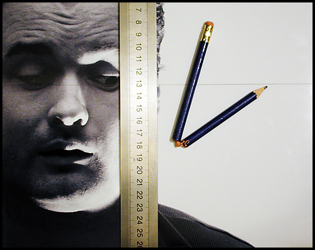
I really like it! great composition, love your explanation! umm, ya, my only dislike is the flash on the ruler, but ya, a little thing compared to the overall photo! very nice John! |
|
 Photographer found comment helpful. Photographer found comment helpful. |
|
|
11/15/2005 08:42:21 PM |
|
Cool idea, and I like it, except for the flash on the ruler, that's my only prob. :) |
|
| Photographer found comment helpful. |
Comments Made During the Challenge  |
|
|
09/27/2005 12:04:05 AM |
|
| Photographer found comment helpful. |
|
|
09/26/2005 09:56:34 PM |
|
Funny idea. Extra point for originality |
|
| Photographer found comment helpful. |
|
|
09/25/2005 06:12:15 PM |
really cool concept and shot.....
good luck, very creative |
|
| Photographer found comment helpful. |
|
|
09/23/2005 07:45:45 PM |
|
Interesting interpretation of the challenge! Wish the flash wasn't so bright on the ruler. |
|
| Photographer found comment helpful. |
|
|
09/23/2005 09:40:26 AM |
|
cleverly done, like idea and perspective on this, meets challenge |
|
| Photographer found comment helpful. |
|
|
09/23/2005 05:36:05 AM |
|
| Photographer found comment helpful. |
|
|
09/22/2005 07:40:29 PM |
|
This is a very interesting photo. I am not to sure if I understand the concept of this photo. It almost looks a little disturbing and I am not to sure why. But it does get my attention and keeps me wondering the meaning or message of the picture |
|
| Photographer found comment helpful. |
|
|
09/22/2005 07:29:29 PM |
|
Looks like an advertisment from a magazine. Very nice. |
|
| Photographer found comment helpful. |
|
|
09/22/2005 06:00:43 PM |
|
Can't be broken in this challenge, though! |
|
| Photographer found comment helpful. |
|
|
09/22/2005 05:37:46 PM |
|
| Photographer found comment helpful. |
|
|
09/22/2005 03:44:09 PM |
|
| Photographer found comment helpful. |
|
|
09/22/2005 08:47:11 AM |
|
Good idea but overexposed |
|
| Photographer found comment helpful. |
|
|
09/22/2005 12:56:38 AM |
|
| Photographer found comment helpful. |
|
|
09/21/2005 08:34:02 PM |
|
Clever idea, and good use of rule of thirds. |
|
| Photographer found comment helpful. |
|
|
09/21/2005 01:42:27 PM |
This picture is absolutley amazing.
1) Incredibly creative take on the challenge
2) Excellent technical execution
3) Hauntingly spooky facial expression (perfect!)
4) Creative title
My only critique is that the light seems a bit harsh, especially around the 13mm point on the ruler and glare on the pencil. Perhaps a diffuser on the light source would have balanced that out a little bit... unless your goal was to draw the eye to the 1/3rds point that is there... in which case incredibly well done! |
|
| Photographer found comment helpful. |
|
|
09/21/2005 11:45:02 AM |
|
This had/has the potential to score higher by me, if the pencil had been more in focus and less light reflections off of ruler and pencil. |
|
| Photographer found comment helpful. |
|
|
09/21/2005 11:19:29 AM |
|
Very cool. I like that you went to some trouble to prove the point without explaining it in the title. This is very graphic and would be a cool ad shot. I wish that the ruller were a touch more focused. The blur of the pencil eraser could use a bit of work. I love the guy's shadowed face and expression. A+ for originality. |
|
| Photographer found comment helpful. |
Home -
Challenges -
Community -
League -
Photos -
Cameras -
Lenses -
Learn -
Help -
Terms of Use -
Privacy -
Top ^
DPChallenge, and website content and design, Copyright © 2001-2026 Challenging Technologies, LLC.
All digital photo copyrights belong to the photographers and may not be used without permission.
Current Server Time: 06/30/2026 01:34:11 AM EDT.