*critique club*
Overall
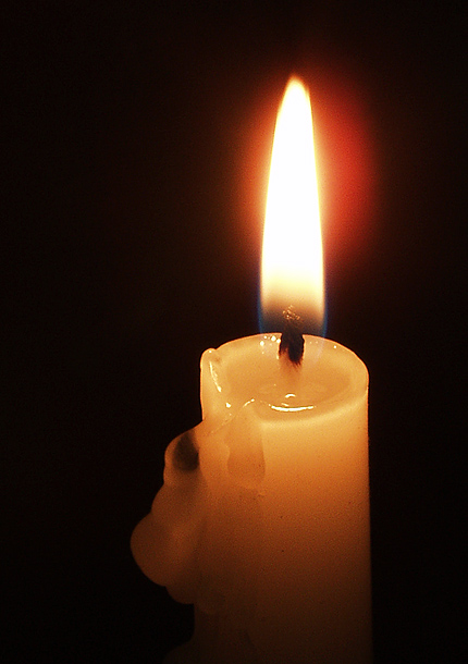
The title 'Silence' is well represented in the stillness of the flame, in the silkiness of the wax and, not least, in the pitch black backing. However, the overall feeling is of lack, not rest because you have the makings of a very good photo here, but I feel that the approach to you subject needs more developing. There is a sense of dullness when we see 'yet another' candle shot. The genre works against you because you have to find a special angle to hold our interest. This angle is missing in this shot.
I've looked at a number of your other shots, some of which are truly excellent. As a long-time member of this site (as opposed to me, in my 2nd week, 1 challenge), you have built up an impressive portfolio. If I were looking at 'Silence' cold, without knowing your other photos, I would be much more critical. Because you are searching for some meaning in your work, I'm compelled to do the same with 'Silence'.
Technical Aspects
You know your subject very well. There is complete crispness in all important parts of the candle, rim, flame and wax. You choose a perfect dof to include only those parts you wanted. The 1/2 second exposure results in a nicely-balanced semi-translucent flame. Framing and composition, again, spot on. At this level of camera-work, you are well on top of the game. I'll say nothing more about that, except to query the yellow cast created by the flame. Would a custom white balance setting to whiten the subject help the feeling of 'Silence'?
Artistic Aspects
For 'Silence', the slightly right-hand side placing of the flame unsettles rather than supports the mood. However, a subject which is bang in the middle might be dull. I think that this shot needs further development, though. Some ideas spring to mind; Waiting until the wax deposits build up more and include more of the left-hand for interest. Macro into the wax itself and concentrate on the actual formation or movement of the liquid. Provide other clues as to the setting which might enhance your intention. I like the gradiation from black at the top through yellow back to black at the bottom. Could this be developed further?
I didn't vote on this photo, but if I had, I'd have given it a 4.
Best wishes,
Jim |