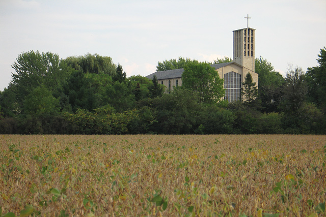
For me, I would like this better if more of the foreground was cropped out. As it is, the large grassy area kind of tricks my eyes into cutting this photo into two. I like the composition you chose.
Colors need to be more contrasty and saturated. Also, it is best not to divide a composition in half, as was done here. A lower angle to get more of the field or higher to get more of the church might have kept that cut in half look away.
Good expression of your concept. IMHO there's a little too much foreground. Try it with the Rule of Thids. IMHO the composition would benefit by more sky and less foreground which is what the Rule of Thirds would give you. i like the subdued colors.





 Add photograph to your favorites
 Add photographer to your favorites


 Photographer found comment helpful.


