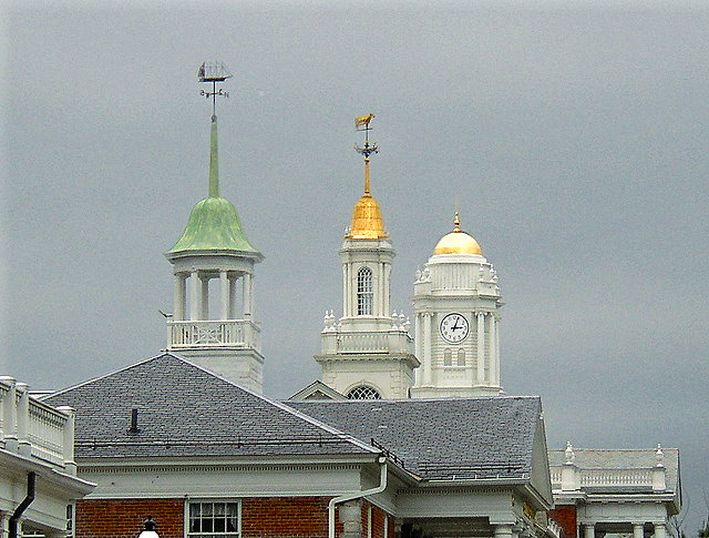
It's oversharpened. Try, if you are using unsharp mask in Photoshop, to use less radius the next time, 0.2-0.5 is normally considered fine for web use.
It's also quite noisy - is this perhaps a heavy crop from a full-sized image?
As for the image itself, I don't really like it how one can glimpse the house below the roof - either you should have included more of the lower portions of the houses or skip that part entirely. You should also have moved slightly to the right so there would have been more space between the tower in the middle and the one to the right and it's quite distracting to the see that part of the building in the bottom left corner.
But quite frankly, I don't find this to be that interesting subject for photography. Couldn't you instead take a photo of the house we see a small portion of the bottom right corner? It seems to be a bit interesting. |





 Add photograph to your favorites
 Add photographer to your favorites


