| Author | Thread |
|
|
12/13/2005 02:25:15 AM |
|
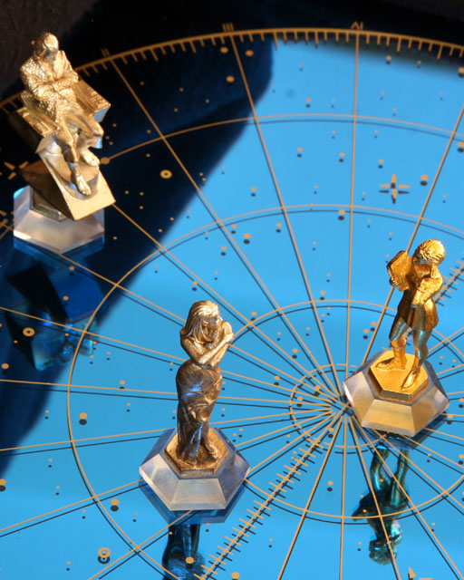
I like this photograph for the luminosity of blue and his symbolic system |
|
 Photographer found comment helpful. Photographer found comment helpful. |
|
|
10/24/2005 11:20:09 PM |
|
Really interesting composition! The colors look really nice on this as well and you have a clear, sharp focus. |
|
| Photographer found comment helpful. |
Comments Made During the Challenge  |
|
|
09/25/2005 04:27:19 PM |
|
original,meets challenge interesting evenif I don't understand the title! |
|
| Photographer found comment helpful. |
|
|
09/24/2005 08:52:53 AM |
|
Very interesting image. I love the colors and the focus is good, but the shadow to the left of the image while providing some contrast, is too distracting IMO. I love the reflection and really think it is still one of the more compelling shots in this challenge. -- 7 -- |
|
| Photographer found comment helpful. |
|
|
09/22/2005 06:25:16 PM |
|
Hitting that intersecting line really works doesn't it. Nice image |
|
| Photographer found comment helpful. |
|
|
09/22/2005 06:19:15 PM |
|
Striking set up. Great photo. |
|
| Photographer found comment helpful. |
|
|
09/21/2005 12:16:43 PM |
|
I look at this and I wonder what is going on. The elements seem to have nothing to do with each other and it confuses me as to what my focus should be. Even though there are leading lines to the lower right intersection, the contrast of the elements draws me elsewhere but pulls me back giving it a tension I do not think belongs here. The statuettes also seem to be out of focus for some reason. |
|
| Photographer found comment helpful. |
|
|
09/21/2005 10:17:35 AM |
Nice concept. With reflections you have to be careful of what you pick up that you didn't want in the image - in this case it appears to be the roof line of a house? The composition is also a bit tight. The bottom left figurine's reflection should all be included, the middle right figurine needs more space to the right, and the top left figurine needs more space to the left (and maybe more up top). This particular piece of glass/mirror is compelling - try rigging it up with a solid white or solid black top cover (hang cloth or poster board over it), or try it on a nice blue sky, puffy white cloud kind of day. Focus is a bit fuzzy nearing the top left figurine - for this type of shot a deep aperture is helpful. The lighting and exposure look fine.
Right idea - just a little more attention to details... ;^) Good luck in the challenge. |
|
| Photographer found comment helpful. |
Home -
Challenges -
Community -
League -
Photos -
Cameras -
Lenses -
Learn -
Help -
Terms of Use -
Privacy -
Top ^
DPChallenge, and website content and design, Copyright © 2001-2026 Challenging Technologies, LLC.
All digital photo copyrights belong to the photographers and may not be used without permission.
Current Server Time: 06/29/2026 12:43:56 AM EDT.