| Author | Thread |
Comments Made During the Challenge  |
|
|
09/16/2005 09:50:13 PM |
|
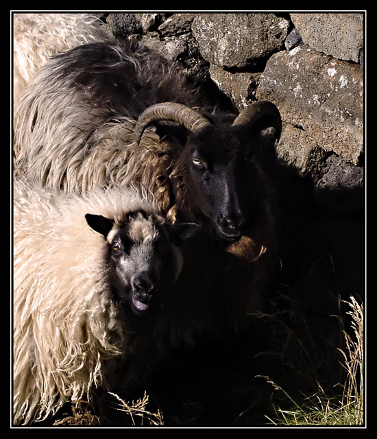
Ooooo I love this. I just wish I could see their faces better. |
|
|
|
09/15/2005 08:12:27 AM |
|
|
|
09/14/2005 07:31:18 PM |
|
the faces are a little lost in the shadows. |
|
|
|
09/13/2005 10:50:42 PM |
|
|
|
09/13/2005 09:48:08 PM |
|
Dang, I never knew mothers had horns !!! Too dark, can't see enough detail of facial features... too much lip gloss on mamma... :-) ....5 |
|
|
|
09/13/2005 04:05:54 PM |
|
Really nice photo, hope this will be appreciated as a portrait.. |
|
|
|
09/13/2005 09:58:28 AM |
|
They blend in too much with the background, and I can't see enough details in thier faces. |
|
|
|
09/13/2005 04:25:23 AM |
the bright parts of this image are beautiful, and i like the grass filling out the bottom right. I wish there were more visible detail in the shadows. if you use photoshop, try this-
hit ctrl - alt - ~ (tilde) to select highlights
invert the selection
ctrl - j to duplicate selection to new layer
set layer blending to screen
... and adjust from there. if you do any re-edits post-challenge, I'd love to see them! |
|
|
|
09/13/2005 03:33:31 AM |
|
DId you meter off teh white lamb? Too much shadows in the wrong place. And not really a portrait for me. |
|
|
|
09/12/2005 09:33:16 PM |
|
The dark shadow in front of them spoils this shot, it draws you eye into the black hole. If you were close enough a bit of fill flash would maybe have brought a bit more detail out in that area and made their black faces stand out a bit better? |
|
|
|
09/12/2005 08:34:52 PM |
|
I'm not crazy about the thick black border. My favorite part of your photo is the sheep on the left. Great lighting in that area. |
|
|
|
09/12/2005 02:41:33 PM |
|
Slightly too dark, imo. I like the move away from people. |
|
|
|
09/12/2005 01:13:23 PM |
|
Very good photo, but didn't feel it was in the spirit of the challenge. Felt like it would be unfare to others to give the score it probably deserved IMO. |
|
|
|
09/12/2005 11:47:23 AM |
|
The lamb looks like she is enjoying posing for your photograph. Nice Sharp Image. |
|
|
|
09/12/2005 10:33:58 AM |
|
That is a beautiful animal portrait! I hope you aren't getting hits because it is animals. . .I love it! |
|
|
|
09/12/2005 07:55:26 AM |
|
Skemmtileg túlkun á viðfangsefninu =) |
|
|
|
09/12/2005 04:49:47 AM |
|
Seems a bit too dark for me. |
|
Home -
Challenges -
Community -
League -
Photos -
Cameras -
Lenses -
Learn -
Help -
Terms of Use -
Privacy -
Top ^
DPChallenge, and website content and design, Copyright © 2001-2026 Challenging Technologies, LLC.
All digital photo copyrights belong to the photographers and may not be used without permission.
Current Server Time: 06/29/2026 09:15:46 AM EDT.