| Author | Thread |
|
|
11/10/2005 07:03:34 AM |
|
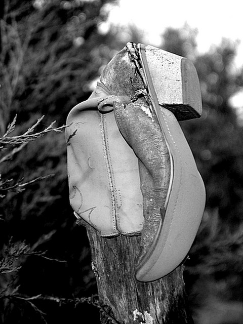
Nice black and white shot the subject is definitely unique. Excellent focus and good use of lighting. Perhaps a crop to place it a little off center, but still a strong image. |
|
|
|
09/07/2005 12:12:08 AM |
The title makes more sense if you know the story. As this is my first entry I didn't know that my comments about the photo could not be read.
They can be now though.
EB |
|
Comments Made During the Challenge  |
|
|
09/05/2005 08:58:35 AM |
|
The lighting seems unnatural. |
|
|
|
09/03/2005 01:33:09 AM |
|
I definately don't get the title...but who cares. The shot is interesting to look at. Focus seems a bit soft to me though. It could just be the lighting making it look that way. Doesn't seem to be ideal lighitng conditions for shooting. I'm wondering if this would benefit from a less centered positioning. Something to think about anyway. |
|
|
|
09/02/2005 01:00:47 PM |
|
I don't get the title but I like the shot. This looks familiar - SLO? I would like to see this in color. |
|
|
|
08/31/2005 04:58:54 PM |
Soul ? Trying to sort out the title...
Photo:
Bottom right is a little distracting Hmm I think it's because it feels like it's in front of the stump.
Top Right to middle is also a touch distracting, as it tends to draw my eye away from the boot. |
|
|
|
08/31/2005 08:34:41 AM |
|
nicely executed. the black and white really makes this look old time, 8 |
|
|
|
08/31/2005 12:14:57 AM |
|
It looks a little fuzzy...but very neat. |
|
Home -
Challenges -
Community -
League -
Photos -
Cameras -
Lenses -
Learn -
Help -
Terms of Use -
Privacy -
Top ^
DPChallenge, and website content and design, Copyright © 2001-2026 Challenging Technologies, LLC.
All digital photo copyrights belong to the photographers and may not be used without permission.
Current Server Time: 06/28/2026 05:38:39 AM EDT.