Author Thread Comments Made During the Challenge
Post actions
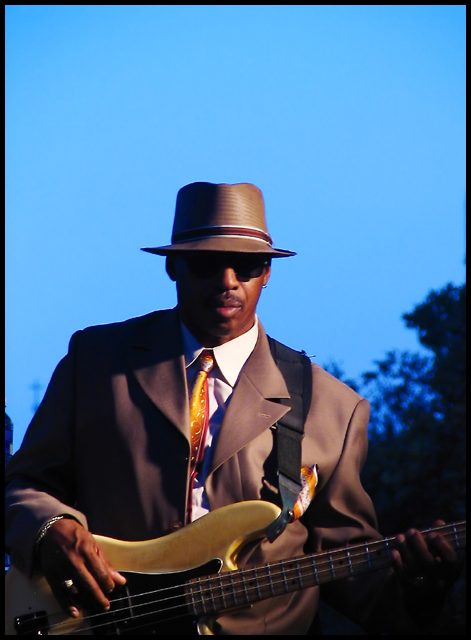
I like the idea of this image, but the lighting is very harsh and leaves a lot of the musician's face in shadow while highlighting his suit.
Post actions
Would this have been better in B&W? IMNSHO the focus allover is a little soft. Also, it looks as if it was taken in the late afternoon or early morning. Doesn't seem right for the Blues, but that's me.
Post actions
nice picture- but you could have panned down just a bit to get rid of all the head room
Post actions
This is really classy. i love it for some odd reason...
Post actions
Post actions
I keep coming back to this one, I like the image and the feel, just a bit too much head room.
Post actions
Too much empty space above his head. Otherwise OK.
Post actions
Cool bass capture. Bumping up.
Post actions
nice one, like the shadow in his face, but i would like too see more of him and less of the sky
Post actions
This image has great tones and feel but I think it has too much sky and not enough player. 7
Post actions
nice colors, the frame is really nice
Post actions
Powerful!
Post actions
a bit over processed for my liking
Post actions
More of his body, less of the sky.
Post actions
too much head room for my taste
Post actions
Post actions
Looks too NeatImaged/blurred to me. Either more or less blue sky would have worked better for me. Here, his eyes are almost in the centre of the shot which seems a bit unimaginative.
Post actions
Tighter crop on the left to crop out dark blue artifact. A tad shadowed...But an interesting capture
Post actions
Cropping off alittle of the sky may have been nice. Nice capture.
Post actions
If you crop it on the top, you would have a far greater picture. Good shot.
Post actions
I know your title is BLUES, but i think there is too much blue sky... takes away from the man.
Post actions
Less sky and more bass would have been cool.
Post actions
Good color, contrast and use of negative space. Love it. 10.





 Add photograph to your favorites
 Add photographer to your favorites


 Photographer found comment helpful.


