| Author | Thread |
|
|
08/17/2005 07:32:36 AM |
Post challenge comments:
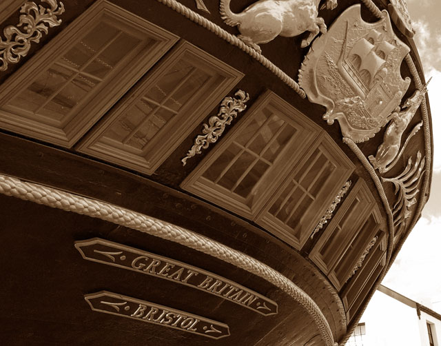
Yes, I'd have loved the house not to be there. But it was, and the challenge was basic editing. :-(
I am not sure what was meant by the tilt feedback. This is the back of the boat, taken from the corner. The camera was tilted slightly upwards; no horizontal tilt that I remember.
Also I thought hard about the cropping, but decided to crop off the unicorn head so as to emphasise the ship - which I felt was important to understand the image given the title restrictions.
Thanks for all the comments.
Ed
Message edited by author 2007-06-19 17:22:54. |
|
Comments Made During the Challenge  |
|
|
08/16/2005 07:36:58 AM |
|
Darn that house in the bottom right! Polarizer might have reduced some window reflections. Cool shot otherwise. |
|
 Photographer found comment helpful. Photographer found comment helpful. |
|
|
08/16/2005 04:38:42 AM |
|
| Photographer found comment helpful. |
|
|
08/15/2005 07:03:20 PM |
|
You have good lighting and great angle but the house in the back is a set back. |
|
| Photographer found comment helpful. |
|
|
08/14/2005 10:44:42 PM |
|
Interesting angle.The detailing is really well done. Love the brown tone of the filter. |
|
| Photographer found comment helpful. |
|
|
08/14/2005 06:02:28 AM |
|
5 - Met the Challenge re a shot of this into a time capsule depicts the era for future generations. Criticism; whilst I like the sepia(?) effect here, given that (I am assuming) there are only a few colors in this shot, the color version may have been more dramatic and captured the detail and 'glory' of this period in time. I would like to have seen the crest in full too, and I just noticed that building(?) right rear, if it was old, then incorporated more else just removed completely from the frame. I guess it was a hard angle to get as is, but somehow bringing the 'artwork' of this ship into the frame more fully, and thus dramatically, would have made it a better photo in my opinion. Well done also for not elaborating on the year, the picture tells it's own story (not to mention what the Challenge description asked for). |
|
| Photographer found comment helpful. |
|
|
08/13/2005 02:08:22 PM |
|
I just don't like the angle of this shot. Great subject, would have been a better shot with a different angle. |
|
| Photographer found comment helpful. |
|
|
08/13/2005 07:22:16 AM |
|
Cool picture, nice, crisp, and clean. IMO I would of liked to seen the unicorns on top centered a little more. The head on the left unicorn is missing. Excellent Job |
|
| Photographer found comment helpful. |
|
|
08/12/2005 11:59:15 PM |
|
FInally! Someone who followed directions, used the year for the title and submitted a GOOD photo. You deserve a 10! |
|
| Photographer found comment helpful. |
|
|
08/12/2005 08:27:26 AM |
|
Great shot, not too sure about the tilt, though. Kinda' makes it feel like the ship is about to slid backwards and crush me. Oh, well, I still really like it! 9 |
|
| Photographer found comment helpful. |
|
|
08/11/2005 12:02:10 AM |
|
Maybe you could have kept the dragon at the top in to photo. 2nd- May be just me, but could you have tilted the camera so it is not as much off-axis? Just my 2 cents. Overall good |
|
| Photographer found comment helpful. |
|
|
08/10/2005 09:00:44 PM |
|
The tilt of this picture makes it difficult to look at without feeling dizzy. Otherwise, I like the sepia treatment and the well-defined tones of the ship. |
|
| Photographer found comment helpful. |
|
|
08/10/2005 02:13:56 PM |
|
I think this might take up too much of the frame and the house is distracting. |
|
| Photographer found comment helpful. |
|
|
08/10/2005 09:56:05 AM |
|
cool composition and perspective |
|
| Photographer found comment helpful. |
|
|
08/10/2005 04:52:42 AM |
|
What is the signified? Imperialism? Colnialism? Power? |
|
| Photographer found comment helpful. |
|
|
08/10/2005 01:57:49 AM |
|
Interesting perspective, but appears to be too crowded in the picture. I don't really like how the left side of the emblem is cut off. |
|
| Photographer found comment helpful. |
|
|
08/10/2005 01:07:43 AM |
|
Beautiful shot, meets challenge. Building in the background is distracting. |
|
| Photographer found comment helpful. |
Home -
Challenges -
Community -
League -
Photos -
Cameras -
Lenses -
Learn -
Help -
Terms of Use -
Privacy -
Top ^
DPChallenge, and website content and design, Copyright © 2001-2026 Challenging Technologies, LLC.
All digital photo copyrights belong to the photographers and may not be used without permission.
Current Server Time: 06/28/2026 03:46:25 PM EDT.