| Author | Thread |
Comments Made During the Challenge  |
|
|
05/13/2003 02:32:41 PM |
|
|
|
05/13/2003 02:05:46 PM |
|
good idea. too much negative space. |
|
|
|
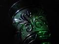
05/10/2003 01:54:16 PM |
|
Interesting perspective, however I find the image feels a bit too dark. Would like tho see the colors pumped up. Love the gradual blurring of the handles. Jacko. 7 |
|
|
|
05/09/2003 12:21:50 AM |
|
no offence, but maybe a difference choice of colour for the background, and buffing up the contrast and sharpness will bring more out from this one. |
|
|
|
05/07/2003 01:42:24 PM |
|
needs more contrast...or lighting |
|
|
|
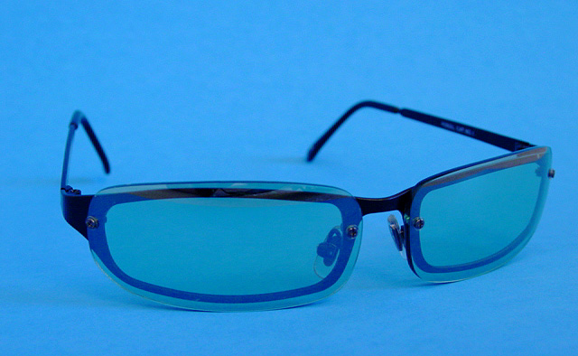
05/07/2003 03:08:49 AM |
|
I have those glasses. i like the image...simple. I might have shifted the hue closer to the actual lens color, since the lenses appear a bit greener than the backdrop blue...I like the monotone idea though. |
|
Home -
Challenges -
Community -
League -
Photos -
Cameras -
Lenses -
Learn -
Help -
Terms of Use -
Privacy -
Top ^
DPChallenge, and website content and design, Copyright © 2001-2026 Challenging Technologies, LLC.
All digital photo copyrights belong to the photographers and may not be used without permission.
Current Server Time: 06/28/2026 04:10:22 AM EDT.