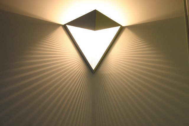
the seam in the wall is unfortunate, closer cropping, or rotate it 90 counter clock and keep the light to the left third might make a nice compostition - it's a great idea, and I think with just a little post work I would like this a lot more - 6
you had a great idea, but a few problems, and I have made similar mistakes before...your picture is slightly tilted, and the right side has something creating static in the composition. Fix those and would have done better.
Looks like a science lesson! I like the interplay of the light beams in the centre but find the contrast with the prism too harsh. I feel texture only very gently.
Very interesting. I realize that shadows don't really count as texture, but the illusion of texture is there. I think this picture would be nearly perfect with a couple minor tweaks: crop the right and left sides in a bit to get rid fo the line in the top right corner (but retain symmetry), and desaturate with levels adjustment to boost the shadows.





 Add photograph to your favorites
 Add photographer to your favorites


 Photographer found comment helpful.
