| Author | Thread |
Comments Made During the Challenge  |
|
|
07/26/2005 03:56:06 AM |
|
Love this picture! Funky composition and treatment of subject! |
|
|
|
07/25/2005 05:16:50 PM |
|
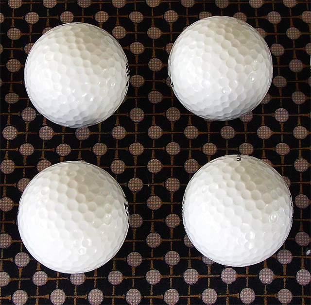
probably hard to get a better idea of the detailed texture on this subject because it is so white so parts of the golfballs show clear texture while parts are overexposed and looking smooth |
|
|
|
07/24/2005 07:25:20 PM |
|
i like the idea here, however the composition seems a bit crooked, and the lower left ball a bit overexposed... too bad you can't dodge and burn |
|
|
|
07/24/2005 02:53:08 PM |
|
could have been more symmetrical |
|
|
|
07/24/2005 01:15:07 PM |
|
good composition, i like the contrast with the backing material, if you had got the pattern between the balls and the material perfectly symetrical i would have given a 9, as that would have worked better for me, but that is purely my opinion- therefore 8 |
|
|
|
07/23/2005 07:27:01 PM |
|
Meets the challenge well. Nice use of light and shadow to convey texture. Background okay, but a little distracting. |
|
|
|
07/23/2005 04:58:07 PM |
|
not symetrical. even numbers need to b |
|
|
|
07/23/2005 10:03:03 AM |
|
Really interesting attempt here. |
|
|
|
07/22/2005 01:29:22 PM |
Fits challenge=5
Color/lighting=1
DOF/focus=1
Wow factor/uniqueness=0
Attractiveness=0
I think I would have preferred to see either all the words on the balls or none at all. Nice setup and your background adds a nice touch, though its a little dirty in the center and lower right.
Good luck |
|
|
|
07/21/2005 08:49:52 PM |
|
A little boring. But the idea is niice. |
|
|
|
07/20/2005 01:19:18 PM |
|
golfballs are overexposed |
|
|
|
07/20/2005 02:14:59 AM |
|
I like the composition against the subliminal background. It is quite distracting though that you can see parts of the text of the golf ball.Maybe this was unavoidable but worth a shot. Compositionally, the symmetry is a bit off. The balls to the left are in perfect alignment whilst the right is just a tad of the mark. The small fleck of lint on the lower right side and the middle is a bit distracting as well. i applaud you creativity though as this is quite different from the rest. Great try. |
|
Home -
Challenges -
Community -
League -
Photos -
Cameras -
Lenses -
Learn -
Help -
Terms of Use -
Privacy -
Top ^
DPChallenge, and website content and design, Copyright © 2001-2026 Challenging Technologies, LLC.
All digital photo copyrights belong to the photographers and may not be used without permission.
Current Server Time: 06/27/2026 05:46:30 PM EDT.