| Author | Thread |
Comments Made During the Challenge  |
|
|
07/26/2005 11:27:36 AM |
|
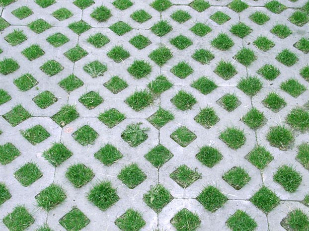
i like it, though a top down perspective may have made a better impression. Good work! |
|
 Photographer found comment helpful. Photographer found comment helpful. |
|
|
07/26/2005 06:07:33 AM |
|
Nice texture! Minimalistic and all. Wish the colours had been somewhat better.. a little more Photoshop and it could have been a 10. |
|
| Photographer found comment helpful. |
|
|
07/22/2005 02:56:46 PM |
|
I like to see new ideas of "texture" :) |
|
| Photographer found comment helpful. |
|
|
07/22/2005 12:41:26 PM |
|
Not very sharp. Nice pattern shown. |
|
| Photographer found comment helpful. |
|
|
07/21/2005 08:55:47 PM |
|
Hey is this from you're house? |
|
|
|
07/20/2005 10:49:08 AM |
|
The white is actually grey. |
|
|
|
07/20/2005 01:19:32 AM |
|
This is a good idea for the challenge. I think if you had taken a closer picture and showed only a few of the grassy squares you might have been able to see the texture better. Also, the lighting is a bit dull - if you pulled the level in a bit on both the dark and light end it would perk it up some, I think. |
|
| Photographer found comment helpful. |
Home -
Challenges -
Community -
League -
Photos -
Cameras -
Lenses -
Learn -
Help -
Terms of Use -
Privacy -
Top ^
DPChallenge, and website content and design, Copyright © 2001-2026 Challenging Technologies, LLC.
All digital photo copyrights belong to the photographers and may not be used without permission.
Current Server Time: 06/28/2026 11:20:18 PM EDT.