Author Thread Comments Made During the Challenge
Post actions
the licht on the back of the wheel is very distracting. nice tones though. picture seems to have been streached a lot so has lost clarity.
Post actions
I like the angle, however the lighting is a bit harsh, and the image a bit busy
Post actions
Subject Impact: Could be more to the point of the challenge
Post actions
Post actions
the spokes are pretty jaggy... looks like it could be a compression issue?
Post actions
This is good set. Interesting subject. The flash causes some balance problems.
Post actions
Ok shot, your highlights are def too blown out though.
Post actions
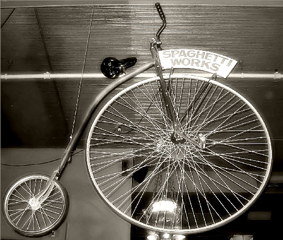
Really cool looking bike. The spaghetti works sign seems a bit bright as does the object near the bottom center of the image. the horizontal lines in the celeing cross behind the spokes in the larger wheel making it look kind of busy right there and the background just doesn't seem like the best background. Focus on the bike seems really good. We can see a lot of detail in the bike. ~Heather~
Post actions
Wow, this one would have been great in the obsolete challenge. Great picture.
Post actions
a little too sharp for me, I like the B/W
Post actions
The black and white with the "old-timey" bike. Classic.






 Add photograph to your favorites
 Add photographer to your favorites


 Photographer found comment helpful.