| Author | Thread |
Comments Made During the Challenge  |
|
|
07/12/2005 07:00:26 AM |
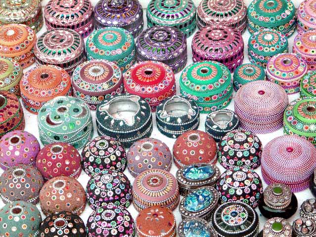
So this is from a paki brother!!!!!
there mirpuri caps are really colorful!
nice one! |
|
 Photographer found comment helpful. Photographer found comment helpful. |
|
|
07/11/2005 10:20:28 PM |
EDIT: "unhelpful" comment removed by voter
Message edited by author 2005-10-05 03:40:17. |
|
|
|
07/11/2005 01:59:46 PM |
Circle Overload! The plain white background is overpowering - the )( shapes stand out - and there's no sense of creativity in the arrangement. The picture is very busy, which is somewhat distracting. Having fewer elements in a more interesting arrangement would have gained bonus points!
As it stands, a nice texture shot. |
|
| Photographer found comment helpful. |
|
|
07/10/2005 02:28:44 AM |
|
super idea to me it appears to be a bit washed out maybe from the white background or too harsh of light ???? |
|
|
|
07/10/2005 12:17:25 AM |
|
For this contest everyone who has the word “circle” in their title is getting a lower score. This is a copy and paste version that I am including in every photo that I downgrade due to the title. We as members of DPchallenge know the topic of the challenge – we do not need to reread the topic every time we reach a photo. If circle is in the title and it is appropriate I will most likely not down grade, but it better be good. I am sorry if you do not agree with my method of protest – but scores are all I have. |
|
| Photographer found comment helpful. |
|
|
07/09/2005 05:35:09 AM |
|
overpowering colours and cirlces - great image |
|
| Photographer found comment helpful. |
|
|
07/08/2005 06:55:16 PM |
|
The colors look a little bit flat. Maybe a curves/saturation/contrast adjustment would have made this pop. |
|
| Photographer found comment helpful. |
|
|
07/08/2005 05:59:32 PM |
|
i would have liked a bit more saturation, very appealing image. |
|
| Photographer found comment helpful. |
|
|
07/08/2005 04:58:29 PM |
|
| Photographer found comment helpful. |
|
|
07/08/2005 12:30:42 PM |
|
| Photographer found comment helpful. |
|
|
07/06/2005 02:17:53 PM |
|
Pretty but too busy for my tastes. It makes it flat and hectic. |
|
| Photographer found comment helpful. |
|
|
07/06/2005 12:05:03 PM |
|
Seems to be slightly out of focus. Also adjusting some of the color balance and or cruves would have made this "pop" more. |
|
| Photographer found comment helpful. |
|
|
07/06/2005 09:04:43 AM |
|
Seems to be a little lacking on the sharpness, I like all the different variety, the colors are nice. |
|
| Photographer found comment helpful. |
|
|
07/06/2005 02:15:33 AM |
|
You've definitely met the challenge and found a circle, or two, or a bunch :) I think there are to many circles to make this composition effective for me though. It's busy to me and that detracts from it's attractiveness. - 5 - JeB |
|
| Photographer found comment helpful. |
Home -
Challenges -
Community -
League -
Photos -
Cameras -
Lenses -
Learn -
Help -
Terms of Use -
Privacy -
Top ^
DPChallenge, and website content and design, Copyright © 2001-2026 Challenging Technologies, LLC.
All digital photo copyrights belong to the photographers and may not be used without permission.
Current Server Time: 06/28/2026 11:47:31 AM EDT.