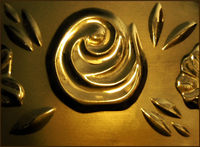
something about the lighting seems wrong here. Not sure how you would have corrected it prior to the shot, but needs some work in editing to get rid of the glare.
The images that always suffer due to lack of comments are the ones that are right in the middle ground. Everyone comments on the awesome shots. Some comment on the bad shots. But the middle ones, very few people say anything. So here I am to explain why I voted a 5:
I think the two things that hurt this image most are: 1) the subject itself lacks in interesting, and 2) the overly strong highlights. I do like the sharpness on the edges, and the light helps in that regard.
So it's neither a bad shot, nor one that stands out from the crowd... and that's why I ended up giving it a 5. Hope this helps.
Because of the softness of the glass the image doesn't feel sharp. I guess some people will misinterpret that and mark it down. Also because of the colour scheme it doesn't have any WOW, which is one of the main things voters look for.






 Add photograph to your favorites
 Add photographer to your favorites


 Photographer found comment helpful.


