| Author | Thread |
Comments Made During the Challenge  |
|
|
07/12/2005 02:09:06 PM |
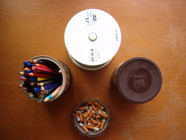
different idea for this image. What I would suggest for future staged shots is to make sure you wipe the surface to remove any hairs, or all that dust on the right side of the image. It really distracts, and can be easily taken care of by taking the time to pay attention to the surface you are shooting. It is the little things that can make a world of difference.
Other than that, good use of depth of field - you have several objects of different heights, and all are in focus. The lighting seems a bit harsh on the DVD's - if there was a window there, I would suggest closing the blinds, and having a longer exposure. You might need to use a tripod to achieve this, could result in more even lighting. Or, move the reflective object to a less lighted area - swithch the DVD's and the ashtray. |
|
 Photographer found comment helpful. Photographer found comment helpful. |
|
|
07/12/2005 01:59:32 PM |
There are several basic things wrong with this photo: overexposed CD's, dusty background, out of focus pencils.
A soft light from front right and front left would help reduce the shadows. the composition is somewhat unimaginative - what story are you trying to portray with these 4 subjects? they don't seem well related. Good effort on the shot position, though - having the perspective into the table is good for abstracts, and would work well with 4 very similar objects.
|
|
| Photographer found comment helpful. |
|
|
07/12/2005 11:44:43 AM |
We all know what the challenge title is. It is too bad that you could not take the time to be more creative with your titleing.
interesting idea, if I was a bystander what would I focus on? too much info, lighting ok, b&w's good, comp ok, balance good, nice texture, nice color, overall not interesting |
|
| Photographer found comment helpful. |
|
|
07/11/2005 10:10:17 PM |
|
For this contest everyone who has the word “circle” in their title is getting a max 10 score. This is a copy and paste version that I am including in every photo that I upgrade to 10 due to the title. We as members of DPchallenge need to be reminded of the topic of the challenge – we really need to reread the topic every time we reach a photo. If circle is in the title and it is appropriate I will give a 10. I am sorry if you do not agree with my method of voting – but scores are all I have. |
|
|
|
07/11/2005 09:25:43 PM |
|
I'm sorry, but this just is not very interesting. It looks like just a bunch of round things thrown together on a dusty desk. |
|
|
|
07/11/2005 05:08:34 PM |
|
cds highlights are blown out, i think if you would have used just one of these it would be better |
|
| Photographer found comment helpful. |
|
|
07/11/2005 11:53:20 AM |
|
the table looks all dusty and dirty. |
|
|
|
07/08/2005 10:55:32 PM |
|
|
|
07/08/2005 05:12:15 PM |
|
Those are definitely circles. Though, the composition, subject matter and lighting don't do much for me. |
|
|
|
07/07/2005 09:48:00 AM |
|
good symmetry but not a lot of inspiration! |
|
| Photographer found comment helpful. |
|
|
07/06/2005 10:19:50 PM |
|
the main thing I notice is the way-too-hot dvd. I can almost smell the ashtray. This pic is hard to look at. |
|
| Photographer found comment helpful. |
|
|
07/06/2005 10:30:53 AM |
|
|
|
07/06/2005 06:57:58 AM |
|
Interesting choice of subjects for the challenge. The white on the DVD's is a little blown out. Your background surface could use a dust cloth. |
|
| Photographer found comment helpful. |
|
|
07/06/2005 02:55:35 AM |
|
its a cute one.. but meaning being? |
|
|
|
07/06/2005 01:32:31 AM |
|
The scratched wood tabletop is a bit distracting. I think if it were three items instead of four, it might be more appealing to the eye. Try shooting it from a slightly different angle might be more effective as well. |
|
| Photographer found comment helpful. |
|
|
07/06/2005 12:04:57 AM |
|
Dusty table distracts from the setup. Also, it should be cropped closer in to remove the excess tabletop showing. |
|
| Photographer found comment helpful. |
Home -
Challenges -
Community -
League -
Photos -
Cameras -
Lenses -
Learn -
Help -
Terms of Use -
Privacy -
Top ^
DPChallenge, and website content and design, Copyright © 2001-2026 Challenging Technologies, LLC.
All digital photo copyrights belong to the photographers and may not be used without permission.
Current Server Time: 06/29/2026 06:59:27 AM EDT.