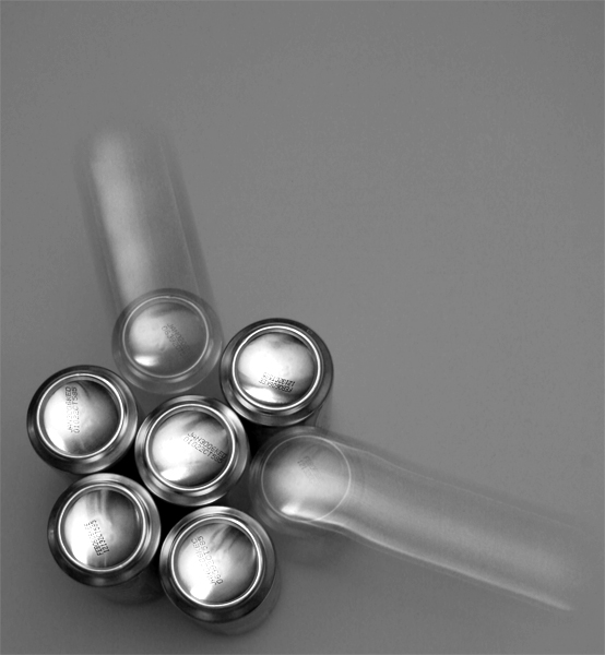
Seven soda cans flipped upside down arranged in the position as shown two tied off with thread, clicked the shutter and dragged the gans back wards and this is the out come. Cant complain at the moment..lets see what the votes claim for the shots value. :)
Noise
USM
Rotate= 90CW,
Crop & Resize= 600 x 554,
Desaturate= B&W,
Contrast=+20 (PS)
Brightness= +10 (PS)
and level = reduced shadows
Statistics
Place: 50 out of 545 Avg (all users): 5.8253 Avg (commenters): 7.0000 Avg (participants): 5.7232 Avg (non-participants): 5.9826 Views since voting: 1274 Views during voting: 452 Votes: 292 Comments: 27 Favorites: 0
I think I liked this a little better before I realized that it was soda cans - the stamps on the bottom take a little away from the shot. However, it's unique - I love the motion and the choice of black & white over color. Nicely done.
For this contest everyone who has the word “circle” in their title is getting a lower score. This is a copy and paste version that I am including in every photo that I downgrade due to the title. We as members of DPchallenge know the topic of the challenge – we do not need to reread the topic every time we reach a photo. If circle is in the title and it is appropriate I will most likely not down grade, but it better be good. I am sorry if you do not agree with my method of protest – but scores are all I have. (neat photo - I am not sure if I should downgrade so I will not)
nice display of dynamic motion ... to me this is a good use of the empty space .. I still think a little could come off the right side but, I do prefer symetry more than most.
Great idea - having taught physics for years I can confirm that technically this simulation is inaccurate. That aside I really like the composition, sense of movement, contrast etc.More diffuse lighting would have been better. Would make a good starting point for an ad. well done and good luck - 7
love the light on those can bottoms...you've captured the metal quite nicely...the movement also does a nice job of leading my eye...but IMO...the gray background is a bit dull...maybe white or black would have been more interesting...it's a hard one because the shadow and highlight stand out quite nicely against the middle-ish gray...still one of the better entries.





 Add photograph to your favorites
 Add photographer to your favorites


 Photographer found comment helpful.


