| Author | Thread |
Comments Made During the Challenge  |
|
|
07/05/2005 12:00:15 AM |
|
IMHO the contast is to light and the subject is lacking. |
|
 Photographer found comment helpful. Photographer found comment helpful. |
|
|
07/04/2005 12:50:44 PM |
|
A bit more contrast would make the photo less flat looking. |
|
| Photographer found comment helpful. |
|
|
07/02/2005 09:38:23 AM |
|
Good one but not enough contrast in there... Nice though 6 |
|
| Photographer found comment helpful. |
|
|
07/02/2005 05:22:09 AM |
|
Looks like it could be better with more contrast |
|
| Photographer found comment helpful. |
|
|
07/02/2005 01:52:55 AM |
|
Too much stuff. Not enough detail to capture the eye. |
|
| Photographer found comment helpful. |
|
|
07/01/2005 04:10:52 PM |
|
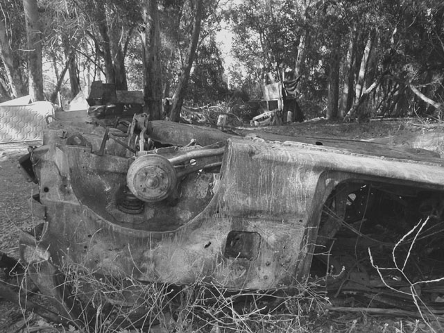
Very low tone for a B&W. Odd composition - the eye is drawn to the wheel hub, which is slightly off-centre - good, but the line of the car is cutting the middle of the photo, which is distracting - upper or lower third would have been better. |
|
| Photographer found comment helpful. |
|
|
07/01/2005 07:01:38 AM |
|
it needs more contrast? (my opinion) |
|
| Photographer found comment helpful. |
|
|
06/30/2005 02:38:05 PM |
|
wonderful idea, but seems a little washed out |
|
| Photographer found comment helpful. |
|
|
06/29/2005 04:16:01 PM |
|
would have liked a bit more contrast here |
|
| Photographer found comment helpful. |
|
|
06/29/2005 02:23:01 PM |
|
Everything is so similar in color, makes it hard to 'find' the subject. A slight increase in contrast would have helped. |
|
| Photographer found comment helpful. |
Home -
Challenges -
Community -
League -
Photos -
Cameras -
Lenses -
Learn -
Help -
Terms of Use -
Privacy -
Top ^
DPChallenge, and website content and design, Copyright © 2001-2026 Challenging Technologies, LLC.
All digital photo copyrights belong to the photographers and may not be used without permission.
Current Server Time: 06/28/2026 11:24:40 AM EDT.