| Author | Thread |
Comments Made During the Challenge  |
|
|
07/05/2005 07:52:10 PM |
|
Electronics are like software as it is being continuously updated. A bit less saturation would have help a lot. 6 |
|
|
|
07/05/2005 05:38:33 PM |
|
|
|
07/05/2005 02:22:10 AM |
|
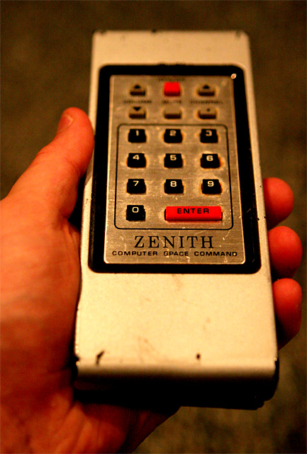
I have no idea what that means but I wish I had Computer Space Command. |
|
|
|
07/05/2005 12:21:07 AM |
|
Nice shot. IMHO a bit underexposed, lacking in composition and white balance is off.. |
|
|
|
07/04/2005 03:59:39 PM |
|
great picture, wish you luck |
|
|
|
07/04/2005 03:50:11 AM |
|
What's the orange blob on the top right corner of the panel? If it's a light reflection, then it could easily have been corrected in situ. It distracts from the blurred top part of the photo. |
|
|
|
07/04/2005 01:03:08 AM |
|
I used have one of these. You are right, it's Obsolete! I give you an eight for good object selection. |
|
|
|
07/03/2005 01:28:24 PM |
|
Skin tones are too far off for natural look. |
|
|
|
07/01/2005 11:53:16 PM |
|
LOL! Just tossed this exact model from gandpa's house! Same wear pattern and all! A little noisy. Great angle. It would top it off to have the old TV in the back ground! :) good luck |
|
|
|
07/01/2005 10:26:10 PM |
|
Too much red tone. The hand almost looks as if it has an orange rubber glove on. |
|
|
|
06/30/2005 11:42:16 PM |
|
|
|
06/30/2005 02:31:00 AM |
|
|
|
06/29/2005 04:37:08 PM |
|
i dont like the colors in here, a little to much on the contrast |
|
|
|
06/29/2005 09:58:50 AM |
|
I like it a lot. I would have liked it more with less red. Nice texture. |
|
Home -
Challenges -
Community -
League -
Photos -
Cameras -
Lenses -
Learn -
Help -
Terms of Use -
Privacy -
Top ^
DPChallenge, and website content and design, Copyright © 2001-2026 Challenging Technologies, LLC.
All digital photo copyrights belong to the photographers and may not be used without permission.
Current Server Time: 07/01/2026 04:33:37 AM EDT.