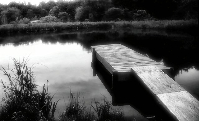
Adjustments in RAW: curves. Then in the graphics program I converted to black and white via the Channel Mixer, overlaid a soft focus effect, rotated to straighten horizon line and cropped, ran through Neat Image, reduced size and applied USM. Also cloned out and used the soft brush to eliminate some power line reflections in the light area of the water.
Statistics
Place: 69 out of 275 Avg (all users): 5.8548 Avg (commenters): 7.4118 Avg (participants): 5.6667 Avg (non-participants): 6.0588 Views since voting: 1066 Views during voting: 306 Votes: 248 Comments: 17 Favorites: 0
Getting negative comments about it being soft? I like the effect, but it don't go over good here. Gotta be spot on sharp or people will assume OOF and vote down. Your horizon appears to be a little tilted and I think I would cropped out the bit of sky in the top left but that's just me.
TC
This is a very interesting image. The b/w really works well and your use of soft focus/gothic glow/diffused glow, or whatever you used, definately adds a sense of fantasy to the image. However, the sky in the left, upper corner is bothering me for some reason. I think it would work better if you cropped it out, but thats just me. Good Luck.
I think your horizon is not entirely horizontal. That said, however, does not make this a low scoring pic as it is absolutely beautiful. great use of B&W>
First thing I notice is that this in a beautiful image! The lighings just seems to make the dock glow with a luminescence. Second thing: the edge of the far end of the lake/pond seems to be tilting a tad to the left. Even if the edge of the pond does tilt to the leftthe image should be compensated to agree with the eye. The choice of black and white here, imo, is excellent. The tones are quite lovely. Although most of my images don't have a human element in them, I think this image may profit from having someone sitting on the end of the dock. I think it fits the challenge quite nicely though, and superb image!
beautiful scene, a good choice for black and white. The top left corner, where we see the sky, feels like we need to see a bit more, but i'm not sure. 8
I really like that dreamy effect, I use it also (just not on challenges yet). Composition is nice but i don't feel like it's leading anywhere. I follow the line across the dock and then it just an open space. Maybe having somthing or someone at the end of the dock would give a subject to lead to. 6
Leading lines or curves generally have two purposes. One is to lead the viewer into the scene. The other is to lead you toward the main subject. It is most effective if they come in from the lower left because that is the natural direction humans visually scan a picture from so are easiest to pick up.
The lines onto the pier and the circle of vegetation are excellent leading lines to the center of the image in this composition.
Nice lighting and composition. I like the dreaminess of the photo and the reflection in the pond. The only thing I don't like is the overexposed area at the top left. The picture also looks a little tilted down at the left. So, perhaps rotating the whole picture to the right a couple of degrees and re-cropping just a tad would straighten the picture and get rid of the overexposed area. 8






 Add photograph to your favorites
 Add photographer to your favorites


 Photographer found comment helpful.


