| Author | Thread |
|
|
07/06/2005 09:28:09 PM |
|
It's actually not a reflection that is across the letters, that is just where the words have worn out over time, across the curved glass. I figured that would be what people thought. But nonetheless, thanks kindly for the comments and votes. Not too horrible for my first entry! |
|
Comments Made During the Challenge  |
|
|
07/03/2005 12:35:38 AM |
|
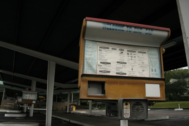
...and it's too bad that it's obsolete! |
|
|
|
07/01/2005 12:51:53 PM |
|
If you could have avoided the reflection across the sign lettering, it would have been nicer-looking. |
|
|
|
06/29/2005 10:03:41 PM |
|
Nice idea. It might have been better if there was more side lighting like in the morning or late afternoon. |
|
 Photographer found comment helpful. Photographer found comment helpful. |
|
|
06/29/2005 08:01:55 PM |
|
Era loooong gone. Bit dark under the roof. But nice shot. |
|
| Photographer found comment helpful. |
|
|
06/29/2005 04:40:56 PM |
|
omg its like the old time sonic!! haha thats amazing!! i love it |
|
| Photographer found comment helpful. |
Home -
Challenges -
Community -
League -
Photos -
Cameras -
Lenses -
Learn -
Help -
Terms of Use -
Privacy -
Top ^
DPChallenge, and website content and design, Copyright © 2001-2026 Challenging Technologies, LLC.
All digital photo copyrights belong to the photographers and may not be used without permission.
Current Server Time: 06/29/2026 12:11:13 PM EDT.