| Author | Thread |
Comments Made During the Challenge  |
|
|
07/04/2005 01:46:49 PM |
|
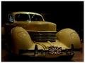
Nice copy work but, for staged shots I think the lighting should be fantastic. A lower placed highlight might have made this more compelling. Excellent composition. |
|
|
|
07/03/2005 02:09:27 PM |
|
nice dof. nice lighting a 10 |
|
|
|
07/02/2005 02:43:16 PM |
|
 Photographer found comment helpful. Photographer found comment helpful. |
|
|
07/02/2005 02:26:04 PM |
|
Fantastic image. Would have worked well in Macro V or Circles, too. I like the colors and contrast most of all. You almost lost me with the foreground DOF but it's okay. The composition including the circles and the strong triangle element is very powerful. This is among my top picks. I hope it ribbons. |
|
|
|
07/02/2005 09:35:06 AM |
|
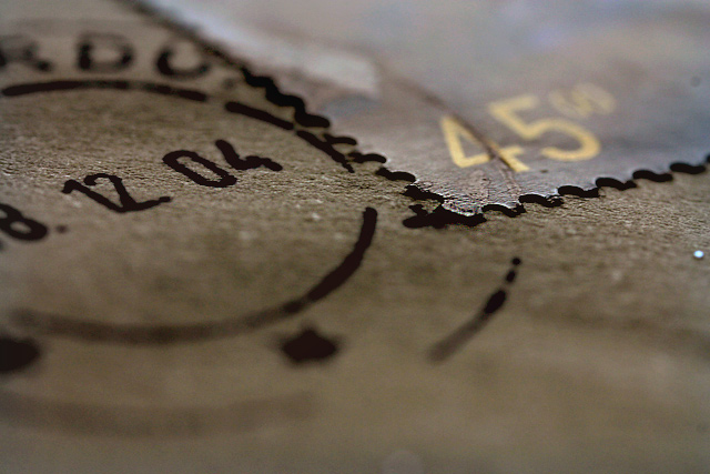
Woh... really nice macro view... I guess it's a stamp... Well focus, we can see the " focus line" very clearly, unless it's a photoshop effect ... hehe. 8 |
|
|
|
07/01/2005 03:15:56 PM |
|
|
|
07/01/2005 10:45:38 AM |
|
I like the composition and the lighting. The DOF is too narrow though. |
|
|
|
07/01/2005 12:34:07 AM |
|
Apparently not since that postmark looks to be only six months old. :( Nice macro anyway though. Good lighting and I do like the focus. |
|
|
|
06/30/2005 11:32:48 PM |
|
AWESOME, this one is just perfect. I love the shallow DOF. |
|
|
|
06/30/2005 08:02:03 PM |
|
wooooooooow, its one of the best, good luck and keep going |
|
|
|
06/30/2005 06:39:25 PM |
|
Quite interesting lighting on this closeup. Makes that stamp look quite thick. |
|
|
|
06/30/2005 04:36:30 PM |
|
The closeness of this image makes the stamp look like a cerated piece of metal. Interesting idea. The shallow DOF draws the eye directly to the corner of the stamp however the cancellation date draws the eye away so is a bit distracting. Also, the part of the image that is in focus is either too narrow or to far from the bottom of the image. I feel that there is too much out of focus in the bottom half of the image. A slightly different perspective may have helped with the placement of the DOF. 6 |
|
|
|
06/30/2005 08:23:25 AM |
|
I hope not otherwise I wouldn't have a job! lol! I like this just wish the bottom of the picture wasn't out of focus |
|
|
|
06/30/2005 06:52:26 AM |
|
Nice sharp edges and DOF. |
|
|
|
06/30/2005 03:00:50 AM |
|
I do think this is my favorite shot of this challenge. 9 |
|
|
|
06/29/2005 07:16:30 PM |
|
|
|
06/29/2005 04:39:45 PM |
|
The detail is just great. The focus is just in the right spot. |
|
|
|
06/29/2005 02:38:20 PM |
|
Nice subject and angle, however not helped by the really small DOF |
|
|
|
06/29/2005 01:59:31 PM |
|
Wow! Now that is REALLY narrow depth of field! I might show more of the subject though, I had to really think about this for a moment before I got it.... |
|
|
|
06/29/2005 09:41:13 AM |
|
Very cool. I like the lighting and the blurred out portion except for the edge of the stamp and the date of the postmark. Well done. |
|
|
|
06/29/2005 09:28:00 AM |
|
Dof falloff a bit sharp imHo. Nice Macro. |
|
|
|
06/29/2005 07:02:45 AM |
|
great capture, like the shallow DOF |
|
Home -
Challenges -
Community -
League -
Photos -
Cameras -
Lenses -
Learn -
Help -
Terms of Use -
Privacy -
Top ^
DPChallenge, and website content and design, Copyright © 2001-2026 Challenging Technologies, LLC.
All digital photo copyrights belong to the photographers and may not be used without permission.
Current Server Time: 07/01/2026 12:25:15 PM EDT.