| Author | Thread |
|
|
07/06/2005 12:04:28 AM |
|
This should have placed higher, but still in the top 50 isn't bad, considering all of the entries. Congrats! |
|
 Photographer found comment helpful. Photographer found comment helpful. |
Comments Made During the Challenge  |
|
|
07/04/2005 04:16:29 PM |
|
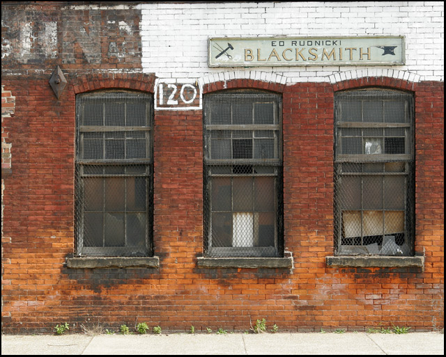
I find the sidewalk at the bottom distracting. A closer crop would've worked better I think. Good idea, though. |
|
| Photographer found comment helpful. |
|
|
07/04/2005 07:28:12 AM |
|
| Photographer found comment helpful. |
|
|
07/03/2005 11:57:23 AM |
|
Good idea ... I think the shot would have been more appealing if you cropped out the sidewalk and some of the nothingness on the left. |
|
|
|
07/01/2005 08:58:28 AM |
|
Nice shot. Perfect interpretation of the scene. Try rotating it 0.68 degrees clockwise. |
|
| Photographer found comment helpful. |
|
|
06/30/2005 04:04:15 PM |
|
Very nice photograph. I like the colors in this, its a really unique image. My only suggestion would be to rotate the image a slight tad, to make the horizon straight. |
|
| Photographer found comment helpful. |
|
|
06/30/2005 08:52:21 AM |
|
Nice colours, the composition conveys the message very well, maybe would have cropped a little bit more out of the left side of the photo. |
|
| Photographer found comment helpful. |
|
|
06/30/2005 05:45:36 AM |
|
The white foreground a bit distracting. Perhaps a crop of just the grass windows and signage would have been different? |
|
| Photographer found comment helpful. |
|
|
06/30/2005 12:44:18 AM |
|
| Photographer found comment helpful. |
|
|
06/29/2005 10:02:10 PM |
|
I like this photo. I keep thinking that it would look better if the sidewalk were cropped and the coloring enhanced to bring out the reds and oranges. Nice job. |
|
| Photographer found comment helpful. |
|
|
06/29/2005 06:23:14 PM |
|
Very fitting for the challenge. I like the colors. I may of cropped out the sidewalk. I |
|
| Photographer found comment helpful. |
|
|
06/29/2005 04:10:56 PM |
|
| Photographer found comment helpful. |
|
|
06/29/2005 04:07:51 PM |
|
Cropping this image to just under the windows would help lead the eye up to the sign and make a more intentionally composed image. The detail is nice. |
|
| Photographer found comment helpful. |
|
|
06/29/2005 02:02:38 PM |
|
Great job. I sure hope Mr. Rudnicki has another source of income, huh? I love photos like this. |
|
| Photographer found comment helpful. |
|
|
06/29/2005 12:59:36 PM |
|
Blacksmith should have been in the centre. Blacksmith hates you. |
|
|
|
06/29/2005 09:57:16 AM |
|
Nice one. Good composition. I like this one alot. 9 |
|
| Photographer found comment helpful. |
Home -
Challenges -
Community -
League -
Photos -
Cameras -
Lenses -
Learn -
Help -
Terms of Use -
Privacy -
Top ^
DPChallenge, and website content and design, Copyright © 2001-2026 Challenging Technologies, LLC.
All digital photo copyrights belong to the photographers and may not be used without permission.
Current Server Time: 06/29/2026 09:07:06 AM EDT.