| Author | Thread |
Comments Made During the Challenge  |
|
|
05/06/2003 08:23:52 PM |
|
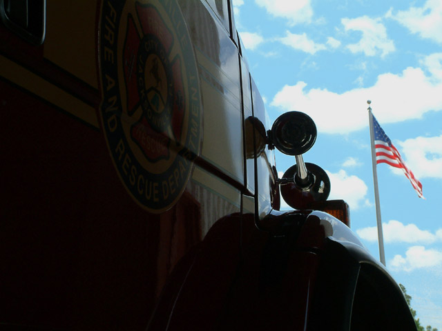
I'm not entirely sure what this is a picture of, seems the subject is more the flag than the too dark vehicle that takes up most of the frame. |
|
|
|
05/06/2003 05:45:04 PM |
|
I like this shot alot. I understand wanting to use a silouhette in a shot, but the fire truck has such great colors, I would wan't to see another shot with more color. |
|
|
|
05/06/2003 05:25:32 PM |
|
It's so dark and claustrophobically-cropped that it's hard to tell just what's going on. |
|
|
|
05/06/2003 01:55:42 PM |
|
i really like how you composed this image, also the image is well in focus and the colors are bright, good work 6 |
|
|
|
05/04/2003 08:44:25 PM |
|
The Sky looks over saturated. I like the composition. |
|
|
|
05/04/2003 04:44:04 PM |
|
Maybe my monitor needs tweaking - I can scarcely see any detail on the door panel. The title intrigued me: the image is TREMENDOUSLY strong and grapphic, but I'd love to see the logo better. |
|
|
|
05/03/2003 09:14:37 PM |
|
Just too dark in the foreground. This really needed some fill flash to balance the exposure. |
|
|
|
05/02/2003 05:58:48 PM |
|
I like the idea you have here, but I can barely read the logo on the truck - better lighting would have gone a long way to help this photo. I like the flag against the blue sky - nice job. |
|
|
|
05/02/2003 01:04:13 PM |
|
Sky and flag too light, shadows much too dark |
|
|
|
05/02/2003 12:56:58 AM |
|
Maybe needs a little more light on the FD logo. 10!!!!! :) |
|
|
|
05/01/2003 02:00:58 PM |
|
a little to dark on the left side hard to make out the image the sky did turn out very nice though good work |
|
|
|
05/01/2003 11:47:25 AM |
|
perhaps a fill flash or reflecting light onto the side of this vehicle would have increased the effect. Because the flag is in such a bright area by comparison, the viewer's eye is drawn to it rather than the intended subject. |
|
|
|
04/30/2003 03:38:56 PM |
|
The transportation subject of this shot is too much in the dark here - I don't know whether that's deliberate or not but it feels too subdued to me. Pity because it looks like a very clear shot. |
|
|
|
04/30/2003 02:39:43 PM |
|
Maybe some fill in flash on the truck would have helped. |
|
|
|
04/30/2003 02:56:30 AM |
|
A bit too dark, but your background is wonderful. |
|
|
|
04/30/2003 01:28:18 AM |
|
Left side is a bit too dark, can't really see what we're looking at. |
|
Home -
Challenges -
Community -
League -
Photos -
Cameras -
Lenses -
Learn -
Help -
Terms of Use -
Privacy -
Top ^
DPChallenge, and website content and design, Copyright © 2001-2026 Challenging Technologies, LLC.
All digital photo copyrights belong to the photographers and may not be used without permission.
Current Server Time: 06/28/2026 02:52:30 AM EDT.