| Author | Thread |
Comments Made During the Challenge  |
|
|
06/21/2005 12:56:11 PM |
|
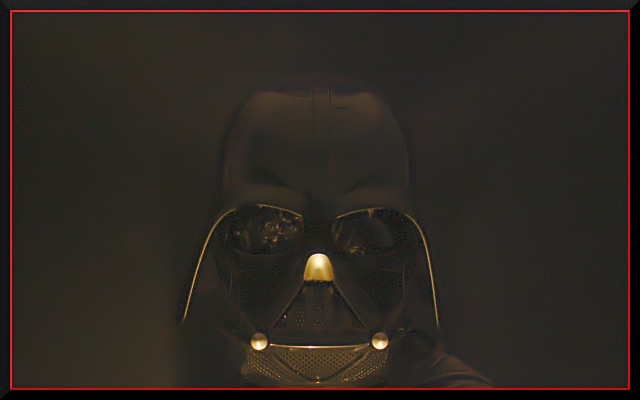
The subject is just a bit too hard to make out |
|
 Photographer found comment helpful. Photographer found comment helpful. |
|
|
06/19/2005 04:33:16 PM |
|
Could have done with being slightly sharper. |
|
| Photographer found comment helpful. |
|
|
06/18/2005 08:35:56 PM |
|
I thought about doing something like this... The red border is much too strong in comparison to the subject, and the lighting might be a bit too forward... not giving enough shadow. The reflection of the mask's eyes is too much. |
|
| Photographer found comment helpful. |
|
|
06/18/2005 02:04:38 PM |
|
seems like his head is too low in the frame. |
|
| Photographer found comment helpful. |
|
|
06/17/2005 07:00:39 PM |
|
i was hoping to see a darth vader image in this series. thanks :) |
|
| Photographer found comment helpful. |
|
|
06/17/2005 05:37:10 PM |
|
i was expecting this shot. seems to be a Darth shot in every challenge. Well composed. |
|
| Photographer found comment helpful. |
|
|
06/17/2005 04:36:32 PM |
|
Good 'ol "Dark" Vader. Decent dark ones and distinguisable dark tones. Nicely done but the eyes do not seem level. |
|
| Photographer found comment helpful. |
|
|
06/17/2005 03:15:38 PM |
|
i really do not care for the frame - the red is the brightest colour in the piece and it draws my attention away from the subject. |
|
| Photographer found comment helpful. |
|
|
06/17/2005 09:19:30 AM |
|
way too much neat image here as u have lost all details and depth. the red border adds a mood to it but i think it is also a distraction to ur image. i like the comp, no blown highlights but the best i can give this is a 7 because of the painted feel rather than a photograph. plus u met the challenge too..good luck in the challenge |
|
| Photographer found comment helpful. |
|
|
06/17/2005 02:37:16 AM |
|
A fitting subject for this challenge. I'm thinking though that for the centered composition, in this case if the subject were to fill the frame more, it might make for a stronger presentation. |
|
| Photographer found comment helpful. |
|
|
06/16/2005 10:24:36 PM |
one word. Incredible, nice title too. good stuff, GL
PS: In my top 4 of the challenge, I just got done voting. |
|
| Photographer found comment helpful. |
|
|
06/15/2005 06:31:38 PM |
|
I like this. It meets the challenge - good old Darth Vader, symbolic of the "dark side" - and the photo is interesting. However, I would have scored it higher without the red border and more 'blackness/contrast' to the background. Best of luck with it though, it's a great image. 7 from me. |
|
| Photographer found comment helpful. |
|
|
06/15/2005 02:24:28 PM |
|
| Photographer found comment helpful. |
|
|
06/15/2005 12:36:17 PM |
|
Agreed. Technology, in some instances, has become very dark. I liked the minimal lighting on this/ It is just enough to tell your story. Didm't like the border, though. |
|
| Photographer found comment helpful. |
|
|
06/15/2005 10:06:11 AM |
|
The title just doesn't work for this shot... The composition is a bit odd in that Darth's head is cropped by the bottom of the frame. I'd like to see it given a bit more room to breathe. |
|
| Photographer found comment helpful. |
|
|
06/15/2005 03:19:07 AM |
|
Home -
Challenges -
Community -
League -
Photos -
Cameras -
Lenses -
Learn -
Help -
Terms of Use -
Privacy -
Top ^
DPChallenge, and website content and design, Copyright © 2001-2026 Challenging Technologies, LLC.
All digital photo copyrights belong to the photographers and may not be used without permission.
Current Server Time: 07/01/2026 03:10:54 PM EDT.