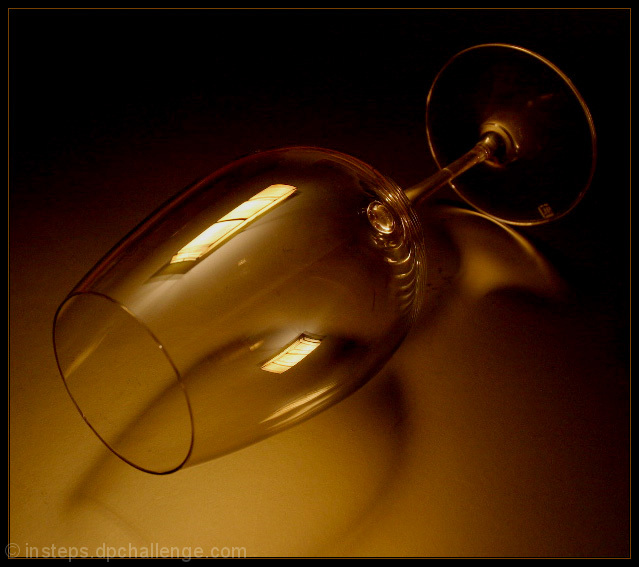
Can't find much to pick on. Simple and effective. The border is complementary. The only thing I see to point out is a sticker or something similar on the base of the glass that looks like it should have been removed and a smudge of some sort on the upper part of the base as well. It doesn't really say anything to me, but I could see it making a decent stock image. Good.
Great use of window light ! I love what you did, the only thing I see is that the picture is a little bit granular, probably due to the high ISO you used ... maybe this was the intencion.. not sure






 Add photograph to your favorites
 Add photographer to your favorites


 Photographer found comment helpful.


