Hi - I 've been reading over your comments on this beautiful image (one of my "9"s).
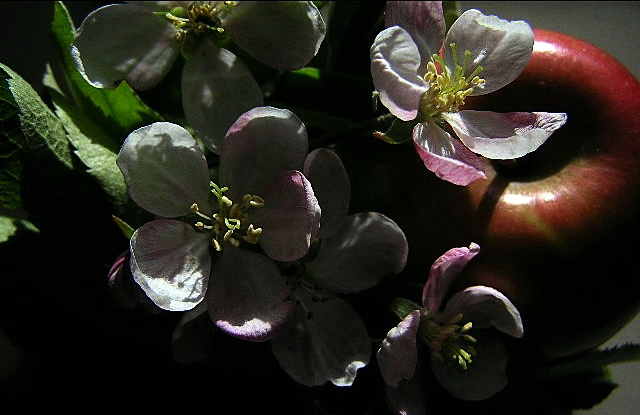
Just want to express a different view. I can see you wanted the picture to have the full range of darks and lights, and achieved what you set out to do. Thus creating a beautifully moody, expressive image that would look good on anyone's wall. A little mystery is a GOOD thing, sometimes.
I'll also add that even though most DPCers try really hard to calibrate their monitors, some do see things differently, especially on laptops.
Neat concept, but the lighting is too stark. The composition itself is nice, but that intense light vs shadow just doesn't do it for the subject matter IMO
This is a very nice composition. Seems to be a little dark. I would have liked to have seen a little more detail in this image. The flower in the upper right corner is nicely lit, but the others are dark. Apple is a little out of focus, and I'm not sure yet if I like that or not. <6>
Your lighting is to contrasty. Because your darks are sooooo dark it gives the illusion that your photo is underexposed, eventhough your highlights are ok.







 Add photograph to your favorites
 Add photographer to your favorites

 Photographer found comment helpful.


