| Author | Thread |
Comments Made During the Challenge  |
|
|
05/17/2005 02:22:24 PM |
|
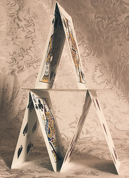
the background was a bad choice for a good choice of subject... |
|
 Photographer found comment helpful. Photographer found comment helpful. |
|
|
05/17/2005 11:42:42 AM |
|
I think the background fabric is distracting. |
|
| Photographer found comment helpful. |
|
|
05/17/2005 10:40:00 AM |
I hate the background. Not big on the composition either, or the idea in general for that matter (only because it's not original as I'm sure you've noticed).
Decent focus though. |
|
|
|
05/17/2005 10:24:41 AM |
|
background is too busy for me, and detracts from the image. |
|
|
|
05/17/2005 05:58:41 AM |
|
I like the soft colors as well as the background. |
|
| Photographer found comment helpful. |
|
|
05/14/2005 02:35:23 AM |
|
The background is an asset to the whole image. Good Job with the tones. and focus. (There are some wrinkles in the background that show as dark areas, something to avoid next time) |
|
| Photographer found comment helpful. |
|
|
05/12/2005 03:05:56 PM |
|
A darker background would enhance the contrast with the cards. |
|
| Photographer found comment helpful. |
|
|
05/12/2005 10:07:25 AM |
|
Very nice, the background serves it's purpose but is a bit busy. |
|
| Photographer found comment helpful. |
|
|
05/12/2005 08:01:11 AM |
|
i don't like the texture behind the cards. looks baroque |
|
| Photographer found comment helpful. |
|
|
05/11/2005 05:10:41 PM |
|
I think the patterned cloth makes the background a bit busy |
|
| Photographer found comment helpful. |
|
|
05/11/2005 07:53:55 AM |
|
Nice shot with good lighting, but maybe a bit oversharpened and the background could be better. |
|
| Photographer found comment helpful. |
|
|
05/11/2005 05:27:31 AM |
|
Looks a bit flat, more contrast or more colours (other side of cards)? |
|
| Photographer found comment helpful. |
|
|
05/11/2005 02:25:15 AM |
|
Nice, the tone is perfect. There is slight jaggedness in the lines, other then that. 9. |
|
| Photographer found comment helpful. |
|
|
05/11/2005 01:14:09 AM |
|
good concept. the color to me is a little dull though. |
|
| Photographer found comment helpful. |
|
|
05/11/2005 01:13:33 AM |
|
Nice, but I think it would have worked better with a solid, darker backround. |
|
| Photographer found comment helpful. |
Home -
Challenges -
Community -
League -
Photos -
Cameras -
Lenses -
Learn -
Help -
Terms of Use -
Privacy -
Top ^
DPChallenge, and website content and design, Copyright © 2001-2026 Challenging Technologies, LLC.
All digital photo copyrights belong to the photographers and may not be used without permission.
Current Server Time: 06/30/2026 02:44:36 AM EDT.