Wow, great idea!
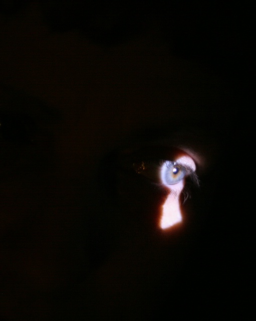
Great use of negative space.
To improve, the eye seems a bit overlit, this could be bettered with some level or curve changes. Other than that, you get a 9 from me
very nice thinking and the keyhole "shadow" was rendered nicely. For this to work better, for me, however, I'd want more details and sharpness on the pupil. Perhaps sharpen, saturate on that part would be very effective for the image.
I like the idea of this photo. The keyhole is well done. The reflection in the corner of the eye is distracting, maybe a bit of dodging would have helped there.





 Add photograph to your favorites
 Add photographer to your favorites


 Photographer found comment helpful.


