| Author | Thread |
Comments Made During the Challenge  |
|
|
05/17/2005 09:20:50 AM |
|
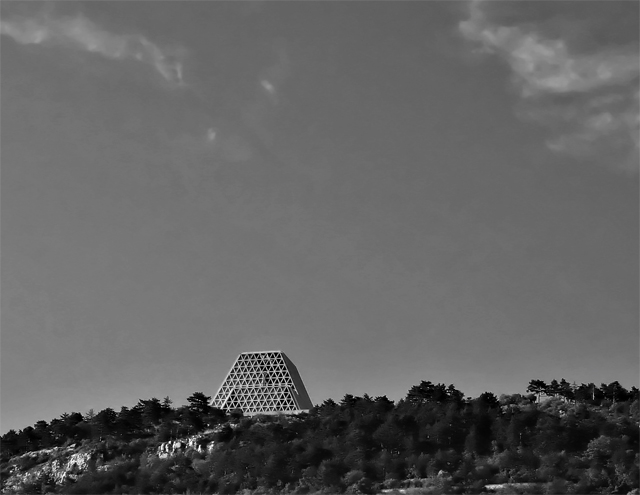
I would have liked this better in color, I think. In black and white detais of very dark trees is completely lost. |
|
|
|
05/17/2005 09:16:56 AM |
More quadrilateral than triangle?
Like the picture enough though but doesn't fit the challenge for me.
|
|
|
|
05/12/2005 09:25:56 AM |
|
I have a feeling this photo would be better in color, the sky looks interesting... |
|
|
|
05/12/2005 12:29:45 AM |
|
I think a closer crop would have really helped out. It would have brought out all of the triangles within the triangular sanctuary. |
|
|
|
05/12/2005 12:07:26 AM |
|
it's a trapezoid really....j/k nice shot. I like the black and white |
|
|
|
05/11/2005 11:38:25 PM |
|
Would have been better if not so far away and so small. Fits the theme well. |
|
|
|
05/11/2005 01:34:39 PM |
|
nice idea, zoomed in a bit tighter would improve the emphasis on the shape I think |
|
|
|
05/11/2005 11:36:18 AM |
|
|
|
05/11/2005 08:56:21 AM |
|
Home -
Challenges -
Community -
League -
Photos -
Cameras -
Lenses -
Learn -
Help -
Terms of Use -
Privacy -
Top ^
DPChallenge, and website content and design, Copyright © 2001-2026 Challenging Technologies, LLC.
All digital photo copyrights belong to the photographers and may not be used without permission.
Current Server Time: 06/30/2026 07:52:18 PM EDT.