| Author | Thread |
Comments Made During the Challenge  |
|
|
05/09/2005 01:16:17 PM |
//www.dpchallenge.com/forum.php?action=read&FORUM_THREAD_ID=196768
//www.dpchallenge.com/forum.php?action=read&FORUM_THREAD_ID=88342
//www.dpchallenge.com/tutorial.php?TUTORIAL_ID=26
|
|
|
|
05/09/2005 08:18:13 AM |
|
I'm sure you are getting this comment a lot but 640 would be better on this. |
|
|
|
05/08/2005 07:32:36 PM |
|
Looks kinda cool, but you really need to re-size you shot over 600 on the long side not to exceed 640 |
|
|
|
05/08/2005 03:35:15 PM |
|
|
|
05/08/2005 03:02:46 AM |
|
What a great potential this photo has... Too bad it's so small. I guess it's either a crop from a much bigger photo, too bad. |
|
|
|
05/07/2005 06:48:18 PM |
|
it really needs to be larger for a fair critique. |
|
|
|
05/07/2005 10:37:52 AM |
|
it's probably a nice shot, but it's too small |
|
|
|
05/06/2005 05:15:40 AM |
|
You must learn the resizing feature. |
|
|
|
05/05/2005 11:23:34 PM |
|
This shot is too small. Size really effects the power of the image. I think this would have been reallly nice, but I can't see the details to be sure. 6 |
|
|
|
05/05/2005 10:55:32 PM |
|
Looks good but.. You need to use the maximum size of 640 pixels, my screen is 1280 pixels wide and you photo is 194 pixels - a bit over 10% of my screen. |
|
|
|
05/05/2005 08:14:38 PM |
|
I like this shot...but I wish it were a larger size so that I could comment on some of the more technical aspects. I think that if you submit to a larger size you'll find that you score better! Good positioning and interesting subject though...great lighting. |
|
|
|
05/05/2005 02:15:03 PM |
|
You need to work on re-sizing your photo. There is plenty of help in the forums. |
|
|
|
05/05/2005 01:46:59 PM |
Pictures this size don't generally fare well. This would have been pretty good, but....
Second pass: Bumping up. It was a good attempt. Really interesting. :) |
|
|
|
05/05/2005 08:47:44 AM |
|
Why such a small picture? It is difficult to see the detail and therefore score fairly. |
|
|
|
05/05/2005 08:13:13 AM |
My guess is that the mojority of voters here will not score this image high or at all based on two reasons. (1) image size (2) because it is black and white.
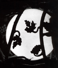
I like small images and I like B&W images so if I am right your in luck....I like all the design elements in this imige, three sigments of different sizes as defined by the two vertical lines, three things that look like leafs in the center, a stronge white ciricle holding the dark detail together. The image reminds me of the art deco style of art of the past century... 8 Nice, different, and precious.
|
|
|
|
05/04/2005 09:45:06 PM |
|
Resized too small... only 194x225 px. you should use the full 640px on the long side. See the resizing tutorial under Learn>Tutorials |
|
|
|
05/04/2005 07:41:40 PM |
|
Would have liked to see this on a bit larger. |
|
|
|
05/04/2005 04:59:03 PM |
|
Far too small, not possible to comment on this shot, sorry. |
|
|
|
05/04/2005 11:27:01 AM |
|
I imagine you will receive quite a number of too small comments. I didn't lower your score for that, but a bigger picture is easier to see. |
|
|
|
05/04/2005 09:33:00 AM |
|
not a bad concept by any means, but the light appears to be a bit overexposed and bleeding blue fringe onto the black leaf silhouettes. Exposing slightly less and/or desaturating the final image would help alleviate these kinds of problems. |
|
|
|
05/04/2005 05:40:50 AM |
|
The image is small. Nice silhouettes, but there's not much detail other than that. |
|
|
|
05/04/2005 05:37:12 AM |
|
Sorry, but although the image looks interesting, its just too small. 3 |
|
|
|
05/04/2005 01:42:29 AM |
|
nice idea...image is really small |
|
|
|
05/04/2005 01:31:24 AM |
|
I really liked the thumbnail and then was disappointed to see that your image is so small and lacking detail. |
|
|
|
05/04/2005 01:27:19 AM |
|
You're probably going to get hammered for submitting a small image. That doesn't actually bother me, so I'm not docking points. I do like the silhouettes and the balance, but I there is just enough of the outer frame visible to make me wish it were better lit so I could see more of the details, which also seem interesting. |
|
|
|
05/04/2005 12:12:00 AM |
|
Love the picture but it's WAY too small. |
|
Home -
Challenges -
Community -
League -
Photos -
Cameras -
Lenses -
Learn -
Help -
Terms of Use -
Privacy -
Top ^
DPChallenge, and website content and design, Copyright © 2001-2026 Challenging Technologies, LLC.
All digital photo copyrights belong to the photographers and may not be used without permission.
Current Server Time: 06/29/2026 01:58:26 PM EDT.