Author Thread Comments Made During the Challenge
Post actions
I don't care for the border.
Post actions
Post actions
Post actions
I personally don't care for this border with this shot.
Post actions
Too much red in the white balance
Post actions
I would like this photo much more without the border...
Post actions
I think you have a good idea here, but the white on white is uninteresting.
Post actions
well done, but I think you hurt the effect of the minimalist photograph with the garish frame.
Post actions
The border really distracts from the image. I am trying just to see the mints, but can't because of the border. 4
Post actions
OK... In spite of the border which IMHO is destracting from this awesome image, you made my wallpaper...Great job on a difficult exposure!
Post actions
Like the use of white. Well executed shot. Don't like the border.
Post actions
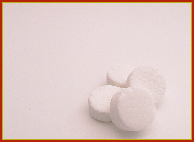
Is everyone telling you that this border doesn't work well with this image? Okay, then I won't bother making that point. ;-) The image itself is a really good example of both a small subject and a white-on-white photo, which works well for either definition of minimalism that you choose. Very nicely done!
Post actions
Post actions
I like the way the mints are almost a texture in the photo almost blending into the back ground. Very interesting.
Post actions
Very nice. Like the white on white, it definitely fits the theme. I like the composition and think its just an all around good entry.
Post actions
nice idea. not sure about the colour tint. Maybe a green (Mint) cast would have worked better IMHO. 5
Post actions
Post actions
I think this would have looked better with a dark border. Otherwise, a nice picture.
Post actions
Extra strong ! think I would have liked this better without the border
Post actions
lose the border; too distracting. Perhaps some more contrast or a little stronger lighting, or maybe not, im not sure, this is a strange image. a little too pink too. 4
Post actions
Looks like this would make a great advertisement shot. Deffinatly fits the minimalism theme.
Post actions
Good one, can you add borders on basic editing?
Post actions
Post actions
The picture is overall too gray. Shooting white on white is very difficult to do. I like how the border reminds me of altoids however.
Post actions
Has a slight colour pink colour cast.
Post actions
Dont care for the pink tint
Post actions
border is distracting...nice idea
Post actions
the dark orange border is a disaster imo.
Post actions
Post actions
i assume you're trying to mimick the altoids box by using that border. clever idea, but i don't think it works well here. it overpowers the otherwise great photo
Post actions
hmmm me thinks we stuck the fancy border to add to the dull image??
Post actions
I think that perhaps stronger shadows off of the mints or that a different colored background would help this shot pop out a bit. I like the placement of the subject, and the image has good clarity.
Post actions
I'm sure I'm the first to tell you this... :) but the border...? Whoa!
Post actions
Funny! Border is horrible (sorry!). But great title, and nice idea.
Post actions
This is great and funny too Very crisp!
Post actions
Post actions
funny, but ohhh that border! Ouch!
Post actions
LOL...love the title. Love the mints!!!
Post actions
would prefer a simpler border
Post actions
The white doesn't seem white enough.
Post actions
Post actions
AHAHAHA Love your title to go along with this great shot! :)
Post actions
I love it when people go the extra bit and take a challenge beyond the literal into the world of word play. Good job with the shot & title. That border looks terrible though, IMO. Disregarding border for grading, though. :)
Post actions
I really like the minimalism of the picture. The yellow and red border just doesn't seem to match the mood of the picture.
Post actions
The border definately takes away from this photo. The white on white would have been so much better without it.
Post actions
Cut eidea, clever title. Probably should've just used one or two and smaller.
Post actions
Very nice... However, I do not care for this border... it really does not add to the photo - I did not take off for it. =) I just think that the colors of it do not look right and takes away from your photo. Otherwise I think you did a very good job. =)






 Add photograph to your favorites
 Add photographer to your favorites


 Photographer found comment helpful.


