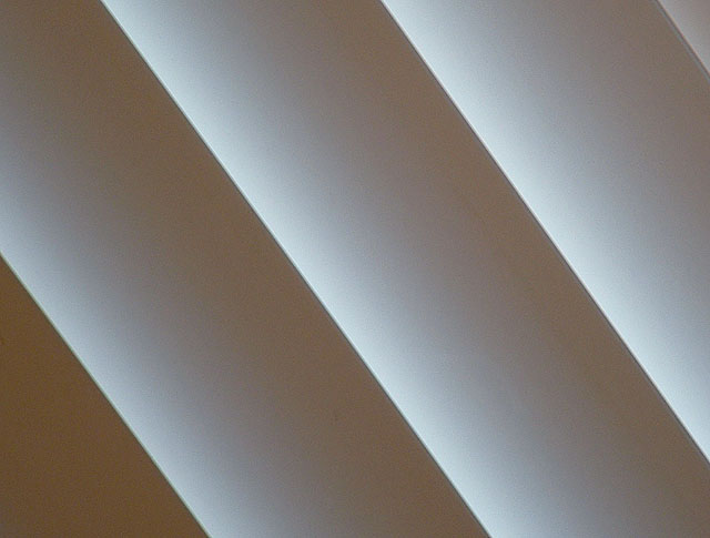
I think its awesome that you are thinking out of the box, out of the ordinary and right on target with what the topic of the challenge was.. Its to bad this one had not scored higher because its really good.. For you to make the blinds going in the diagonal direction is superb as well. Its got a nice soft feeling but yet its sharpened right.. A good contrast too.. Well done for the frist challenge... Keep at it I'd like to see you and Sara win a ribbon... Well I would like to too but I have a lot of improving to do or to find a subject, shoot it well and hopefully the dpcers here will like it.. I think the majority of how you win here is if it appeals to the voters... dont let that discourage you though there are some that have a mind... Peace!
I really like this but in my interpretation it doesn't meet the challenge as defined in the instructions. It does, however, comply with the movement in art called Minimalism. That makes it difficult to rate. I believe some members are scoring one way and others are scoring the other. Too bad about the confusion. I hope I'm not the one who is confused.
Very minimalist by definition.............................10
Meets challenge description...............................0
Technical.............................................................5 looks as though the images is breaking up in places
Artistic.................................................................6 You made a boring image grand by your framing.....and It speaks about, "Blinds" but what can you really say about "blinds"?
It is nice to see someone who looked at the true definition of minimalism. If I know the DPC crowd, they are judging solely based on the challenge description. I however, am not. Very nice minimalistic photo.
Many will miss this take. To me it is only the highlights deliniating the lines. I like the image because it pushes the menaing of the challenge. For example, this image has that abstract look and I would have called it "Lines" Bumping up.
I think this fits the idea of specific term minimalism, in that there are few colors and lines, and so I applaud that -- however, it doesn't fit the actual description of the challenge.
"Create an image where your subject is the strong point of the image, but only occupying a very small portion of the image space." I think you did "Macro"
Nice lines. Looks a bit enlarged??? I support the concept, but I would have liked a smoother texture that suits the lighting - the pattern on the curtain too closely resembles digital artifacts from low quality light sensors - an unfortunate distraction. I think also the top right corner detracts from the symetry of the rest of the image. Pay close attention to the edges too - they apear either out of focus or enlarged, and suffer from sharpening effect.
This doesn't meet the challenge description, but it's minimalist in the classic sense, so I'm not scoring you down for that. It's an interesting concept, but lacks something to make it memorable.





 Add photograph to your favorites
 Add photographer to your favorites

 Photographer found comment helpful.


