DAMN-- this is almost perfect--
the crop is off, lose more of the right side..
and during post the band got Brown, not silver?
This was a great try.. 8 for the effort
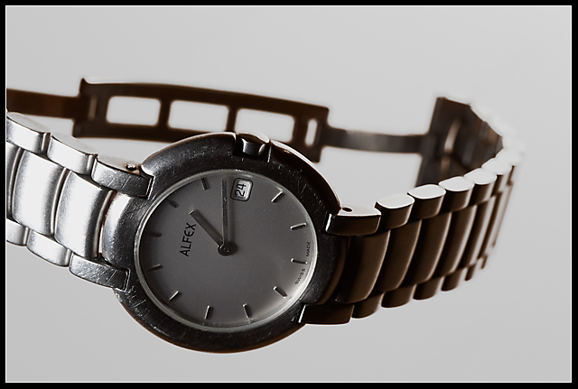
Would've been fun to have more light on the face of the watch. Lighting itself ain't bad, but ain't special either. Grey background makes the pic quite stale. DOF is good tho. 6
Interesting floating affect. I would only wish for the face of the watch to be tilted up a bit (but I'm betting you didn't do that because of the scratches...sign of a well-loved, well-worn time piece :-D).
There is a great tutorial in the "howd they do that" on taking a photo of a watch. The foreground seems a bit dark so it is difficult to appreciate the beauty of the watch. 6
Why is the clasp open? Nice watch, obviously worn - so the advertisement is...? As a stand alone image the lighting is good, nice contrast, and I like the gray background. Good luck.
Nice use of light. One of the aspects of this challenge is that the photo should be something that would be used in a jewelry advertisement. This is really picky, but you won't see a watch laying sideways in an ad. Gave this a 6.
Good job on the lighting / shadows (or lack of) here.
Not sure I would be tempted to buy this one - it's all scratched up (just kidding!) - We gotta' work with what we have at times and pretended it was a brand new one for this shot.
Part of the watch is cut off on the left and the watch is . I think this would of worked with an add for a new one..or to show how long they wear and how well. I do think your light control was good and I like the focus.





 Add photograph to your favorites
 Add photographer to your favorites


 Photographer found comment helpful.


