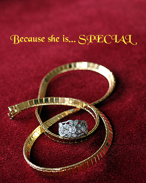
Interesting curvy composition and presentation. DOF is good and intriguig, colour is sharp and appealing. I'd wish for a little bit more sharpness on the ring, perhaps some more contrast as well. Text is a bit too flashy for my taste, but is non intrusive, which is good. A frame (black or dark) would do very well here. 7
i feel a bit confused while veiwing this ad ....i would have picked one piece or the other the two you chose dont compliment each other...and the focus on the chain above the ring pulls my attention...just my opinion ...g/l
I think the use of shallow DOF (which I really like) is generaly not a good idea for especially jewelry advertisement theme. I think the more detail of the jewelry, the better. It would have been better if the area just behind the ring was in focus. The choice of text font and color is debatable.
Ok. DOF may be a bit shallow for the jewelry. I understand the concept for the fade to back. The piece in the center is almost distracting to the gold chain. Good job on the lighting and I like your choice of text (words and font style). Good luck.
I like what you did here with DOF and placing the text in the out of focus area, i wish more of the necklace was in focus. You probably didn't need to get the whole necklace in but With the comp you used, you'd need a deeper field. The ring makes it crowded and seems out of place. Seperate the two or exclude the ring. I love the text and the font. It really jumps out at you.
If your are just going to use the one line of type, I think I'd move it up -- it feels a bit unbalanced. Good job capturing both gold and silver tones, and getting the focal place on the main subject.
Reflections on the gold is always tough to control and the red reflections kind of distract a bit. Can't say as I care much for the text/font used.
Still met the challenge and composition was not as static as it could have been (not boring)
Not too sure about the color of your font, but otherwise I love it (and I'm not about to vote you down for the text). I like the way you arranged the jewellery, I like your background (both color and texture), and your choice of DOF. Well done!
I like this very much and gave it a good score. You chose a nice font for this, however, I think it could be improved by changing the color of the font. The yellow overpowers the jewelry because it is so bright. Next time, try using your color picker and choosing a color already in the photo for the text. The text would then harmonize witht the photo better. You can try this without reshooting. See if it doesn't improve it. PM me if you'd like after the voting ends.
Quite a nice image - though ring propped up like that feels a bit odd. Text - I don't like. Font is fussy. Colour is very strong for a pale-ish image. "Special", in England at least, has other connotations.






 Add photograph to your favorites
 Add photographer to your favorites


 Photographer found comment helpful.


