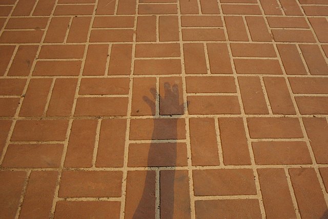
The horizon is level or darn close to it, but something about this composition makes it look tilted to the left. I like the shadow idea, but in minimalism there's so little to look at that everything has to work well, and somehow this doesn't feel right. Maybe it's the oddly parted fingers or the angle of the arm. Placing the focal point in the center of the frame divides it in half and makes me focus on the sides of the image (which contain slightly dirty tiles) rather than the shadow. Given the grid-like background, you probably should try to keep the shadows either as linear as possible (echoing the background) or as non-linear as possible (to be complemented by the background). Given the bland color of the tiles you might have been better off going to B&W or throwing in a flower or something as an isolated spot of color.
Like the use of the brick as a background, but this would be more effective if the image was taken straight down on the brick. The perspective feels awkward with the hand.
Though you do have a minimalistic image, following the challenge's guidelines in every aspect, I feel the shadow is not such a strong point (it lacks contrast to the background and should be darker). Nice try and effort, though. Good luck.






 Add photograph to your favorites
 Add photographer to your favorites


 Photographer found comment helpful.


