Author Thread Comments Made During the Challenge
Post actions
Post actions
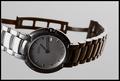
I had to study this for a bit to understand it, and had no idea that was a sword/dagger at first. Main focal point is lesson the gold band than the sword and in my opinion, should be the other way around. Mixed feelings on the text / font. (5)
Post actions
this earned a good score on concept and general composition ... given this was an advanced editing challenge i think accentuating ring and contrasting the text in upper left would have improved overall presentatoin
Post actions
I like the use of the knife, however the ring itself could have been a little brighter. But keep the background the same shade it is now.
Post actions
Post actions
Post actions
A very good composition. A bit more aggressive lighting would have invited more attention and higher votes. Bumping up.
Post actions
Nice concept. It would do better with a closer crop, better lighting to reduce the shadows, and the gold should shine.
Post actions
Interesting composition, but not an appealing ad. Jewelry should be a "fun" purchase, not a battle.
Post actions
I like this. I wish the light had been a bit more on the ring to give it that gold shine. But very well done. 9
Post actions
Post actions
Cool shot, I like the simplicity of the idea.
Post actions
Excellent take on this challenge - very nicely done
Post actions
Took me a minute, but now I get it...it's a knife blade? Interesting ring. Wish I could see more of the details. Good luck in the challenge.
Post actions
good idea - but lighting needs improving
Post actions
reflections on gold are distracting
Post actions
Post actions
Unfortunately all too true. Hmmm ... and it could be that what that ring says is thousands of years old too.
Post actions
Interesting looking ring. Setup is nice, unfortunate that the background was so close to the items, as they drop shadows which ruins the effect. Text is rather poor and doesn't bring anything to the picture. 5
Post actions
I don't know if this is pro jewelery. I like the comp and depth.
Post actions
I can barely see the text on the top left... I actually had to tilt my monitor to read it... :)
Post actions
I think more contrast between the subject and background would have really made this pop.
Post actions
Nice display but the text is hidden in the darkness of the top of the image.
Post actions
not crazy about font..and upper left corner in shadow too much...gl
Post actions
Photo is great. Maybe a little dark, but mainly I don't like the text treatment. Simple white lettering would've been better. Good job though.







 Add photograph to your favorites
 Add photographer to your favorites


 Photographer found comment helpful.


