Thanks all for your votes and comments. This was my first ever entry, and while I liked the idea time prevented the execution from being perfect. For those of you who took time to comment & vote - thanks.
This would be better if "taller."
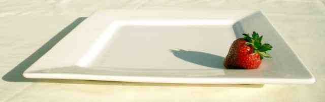
Smoothing the crease & wrinkles from the tablecloth would add a formal elegance contrasting the flawed plate.
I like this image.
Nice concept. Hard sahdow casted by the straberry and the plate are distractive. You should have tried to reflect sme light from the left side to wash out shadows a bit.
Great concept. I especially like the idea of the frame (of the plate) within the frame (of the photo itself). The orientation of the lighting bothers me a little, though. Given that my eye tends to move from right to left and from bottom to top, the shadow draws me away from the strawberry instead of towards it. I think this might have been a little better if the strawberry were in the upper left and the light source was also from the upper left. This would have caused the shadow to draw my eye from the center of the photo to the strawberry, moving from right to left and bottom to top.
The lighting and exposure could use a little work (imo). The whites are a little blown out. Nice idea though. Perhaps taking the picture looking down on the plate - the white plate and red fruit make a good contrast.




 Add photograph to your favorites
 Add photographer to your favorites


 Photographer found comment helpful.


