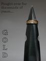
Nice picture. The text is hard to read on this background, but I'm not deducting for text. I would have liked to see a bit more contrast between the ring and the background.
Nice rich colors. The type style and colors are nice but that is a common problem in advertising: creating a background to withdtand the type without losing intensity due to uneven background colors and tone. Bumping up on good effort.
This is a really nice image, it is the color, placement and maybe the font used I find a little distracting, excellent picture though...nice texture and clarity.
Text dissappearing into the BG but the texture of the stone looks fantastic. Great shadow too, shame the challenge didn't allow more special text to be used as a dropped shadow on the text would really set this off. Good luck anyhow :0)
Nice composition but an unfortunate choice of text color...It's difficult to read in places and takes the focus away from the beauty of the turquise in the ring.
I love this piece of jewelry and think the composition of the photo is very good. Lighting is a bit one-sided but works ok here. The big negative I have is the color choice of the text...it's hard to read parts of it against the light colored background. Overall, very nice. Good luck in the challenge.
Very nice focus on the piece itself, but I feel the shadow distracts and the font is both too small and too ornate, making it not as clearly legible particularly at the right bottom corner. Change of font and angle of lighting and this would be more effective for me. 7
Very nice comp. I really like the way the pice dominates the but lays a soft shadow. The text, I think should be a different color and the font doesn't go too well with the feel of the piece (Amercan Indian, Mexican/South Western...I assume?)
Text gets lost. It could of used a black stroke of .5 point to really stand out. I like the font and the piece. The Dof and text mix wonderfully (putting the text in the out of focus area). Edit: I didn't know you can't use a stroke because its against DPC rules. You'd need a diffrent color font or background to get it to stand out. I really like the comp here.
For an advertising piece, you really don't want the shadows which tend to be distracting. This is a shot where a macro ring would have given you the light that you need to fully illuminate the stones.
Composition was pretty decent here, but the font used and it's color are hurting this submission. I have a lot of trouble reading it, particularly in the light background areas.
You should have skipped the text since the picture without it is really good it is destroying the picture. Another color on the text would be better I think.
This is outstanding. Wonderful lighting and great DOF. One of the best I have seen so far. My only little nit picky thing is that i wish the text was in a darker color, its a little difficult to read.






 Add photograph to your favorites
 Add photographer to your favorites


 Photographer found comment helpful.


