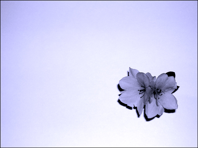
I wouldn't change a thing about this one. I'm very surprised that it didn't finish higher. Nice soft color and lighting, I even like the shadow behind the flower as it separates it from the background. Great job.
I think the colour works against this image, Blue is a cld colour with all that it conveys, it also recedes the image into the back ground. A warm colour (red,yellow orange) jumps forward, therefore I feel if your flower had been warm with theblue background it may well have done better,
After looking at all the different themes with the same subject placement in this challenge I don't think I can rate this higher than a 5. This sort of image does not move me beyond the, "thats pretty" stage.
I really like the composition with the darker edges and corners. I wonder what this image would look like with the blacks lightened up some? The whole picture portrays a feeling of softness until my eye hits the dark and bold blacks around the flower. Maybe a little less contrast?
nice. I was at first inclined to mention the darkness on the sides but since it it uniform and on both sides and top it really works with the image. Not sure if the flower could have been better another color but still a good image...good luck






 Add photograph to your favorites
 Add photographer to your favorites


