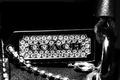
I like the way the light is caught on the right edge of the ring. However, I'm distracted by the reflection on your foreground. It would also be helpful if the leading edge of the ring had some more light on it. You can't really see the band.
Wow - this jumps off the page at me!
Clarity & cut - no wait that would be rating a diamond - the clarity & detail here look pretty good and from the number of stone facets, a nightmare to shoot without reflections, which are very present in the shiny surface this was shot on.
Had you placed this on black velvet, a black mirror or similar, I think it would have looked a bit better and the distractions in the foreground (reflections) wouldn't be so strong. Not sure the font style works for me, but a minor thing really. (6)
Wow! Great color and clarity! Very nice. Even a starburst to boot... Can't decide if I like the reflection or not - guess it's ok. Anyway, best of luck in the challenge.
Good lighting on the diamonds. Ring not enough lit I think. One side of the ring is in almost total darkness. Reflection too dim; it's distracting instead of usefull. A more intense reflection or none at all would have been better.
For a jewelry advertisement, the lighting across the stones needs to be almost equal on all areas. in this case, the stones on the left side of the image are in deep shadow which is very distracting.
It would have been nice if the stones on the left side had light on it so it too can reflect and show off the stones. The reflection should be complete or not there at all. My opinion.
"Elegant Bling" seems like an oxymoron to me in some way...I tend to equate "bling" with tacky and tasteless....that being said....this is a lovely picture, beautiful light and clarity...the text was just not necessary.
What did we say about putting the word 'bling' in the title - and you dare to put it on the image as well!
Seriously, nice reflections of the light everywhere. I also like the placement on a reflective surface - worked out well. 8.
I personally don't care for the large white text with this shot at all, maybe something a little more subtle would not take away from the image as much.






 Add photograph to your favorites
 Add photographer to your favorites


 Photographer found comment helpful.


